Project overview
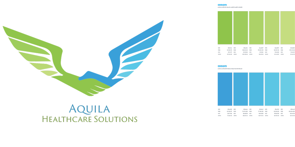
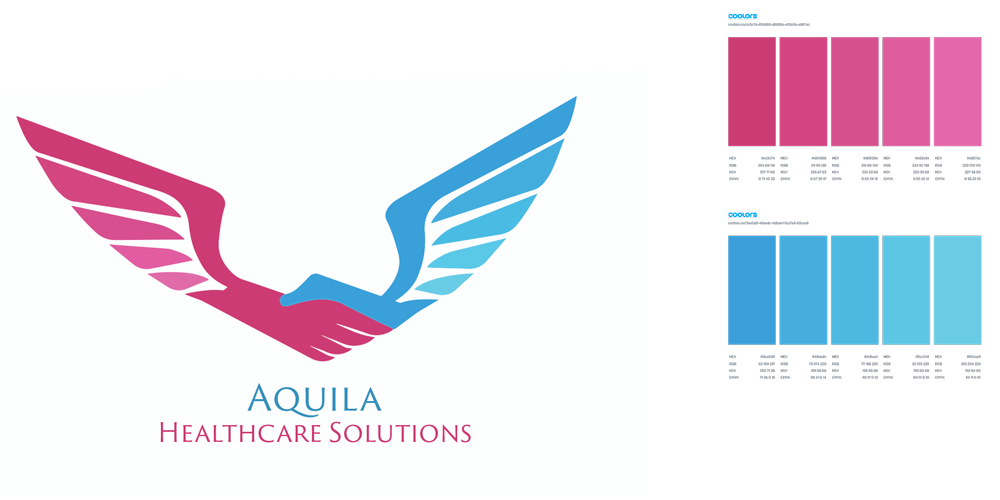
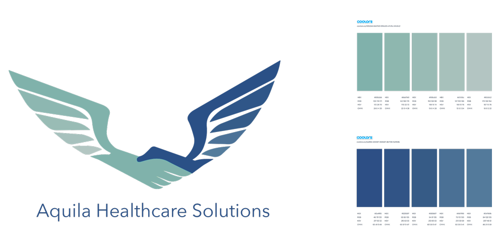
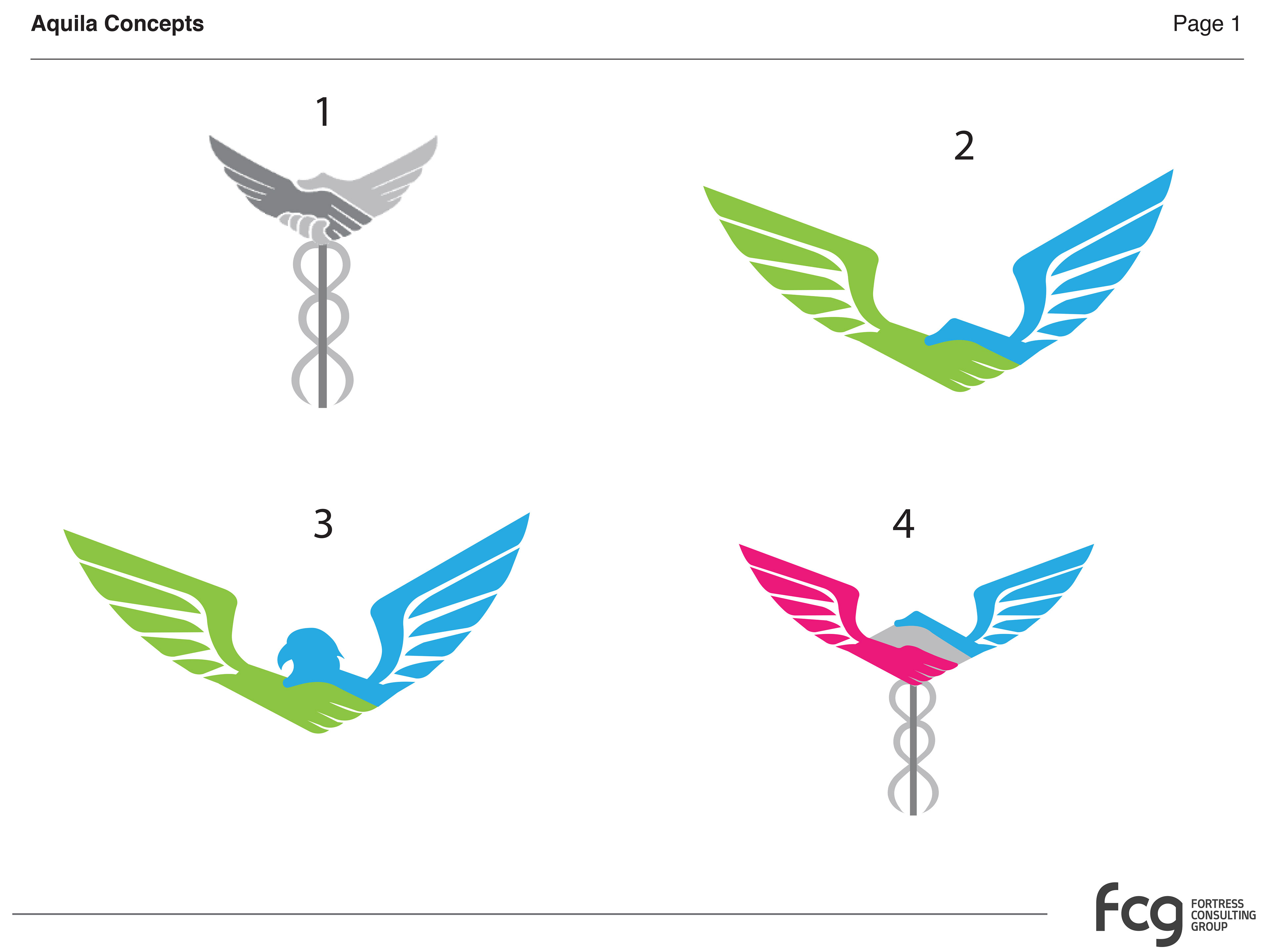
While working at Fortress Consulting Group, I contributed to the refinement of an existing logo for a medical company. The objective was to expand the visual system by exploring color palettes, gradients, and typography, and to develop updated logo variations for client review.
Process
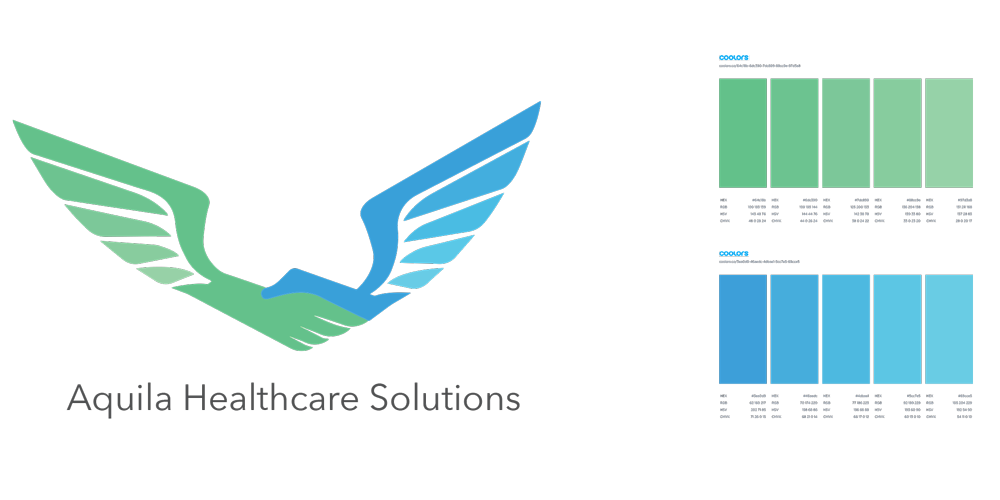
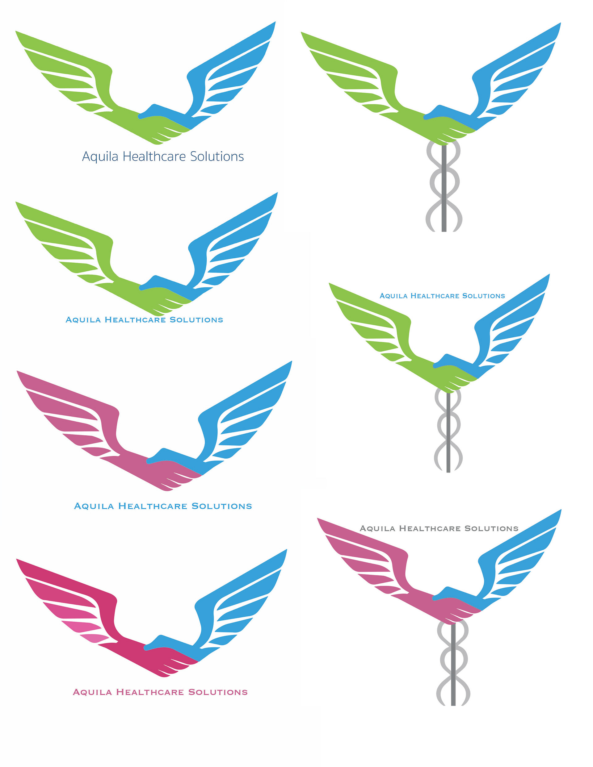
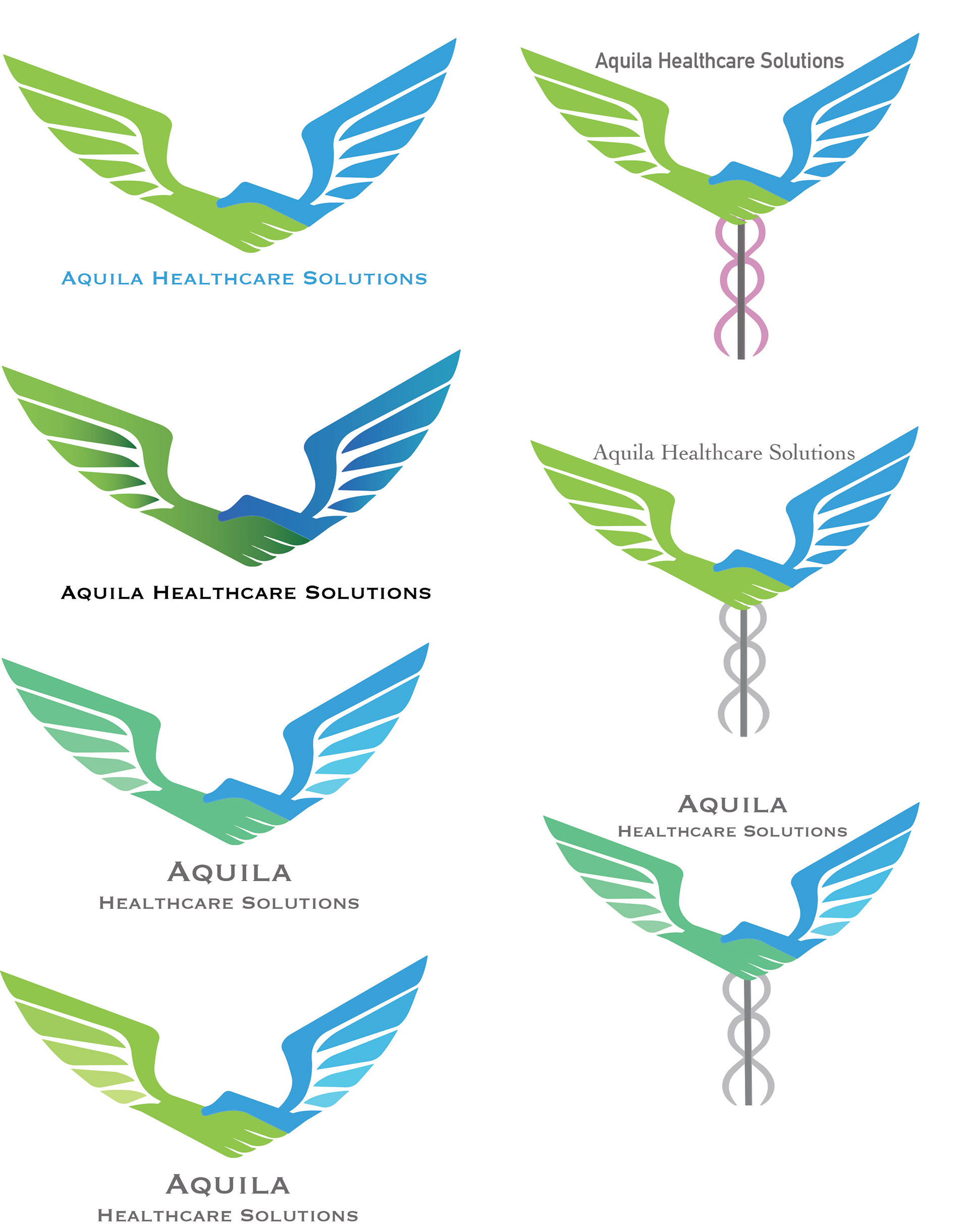
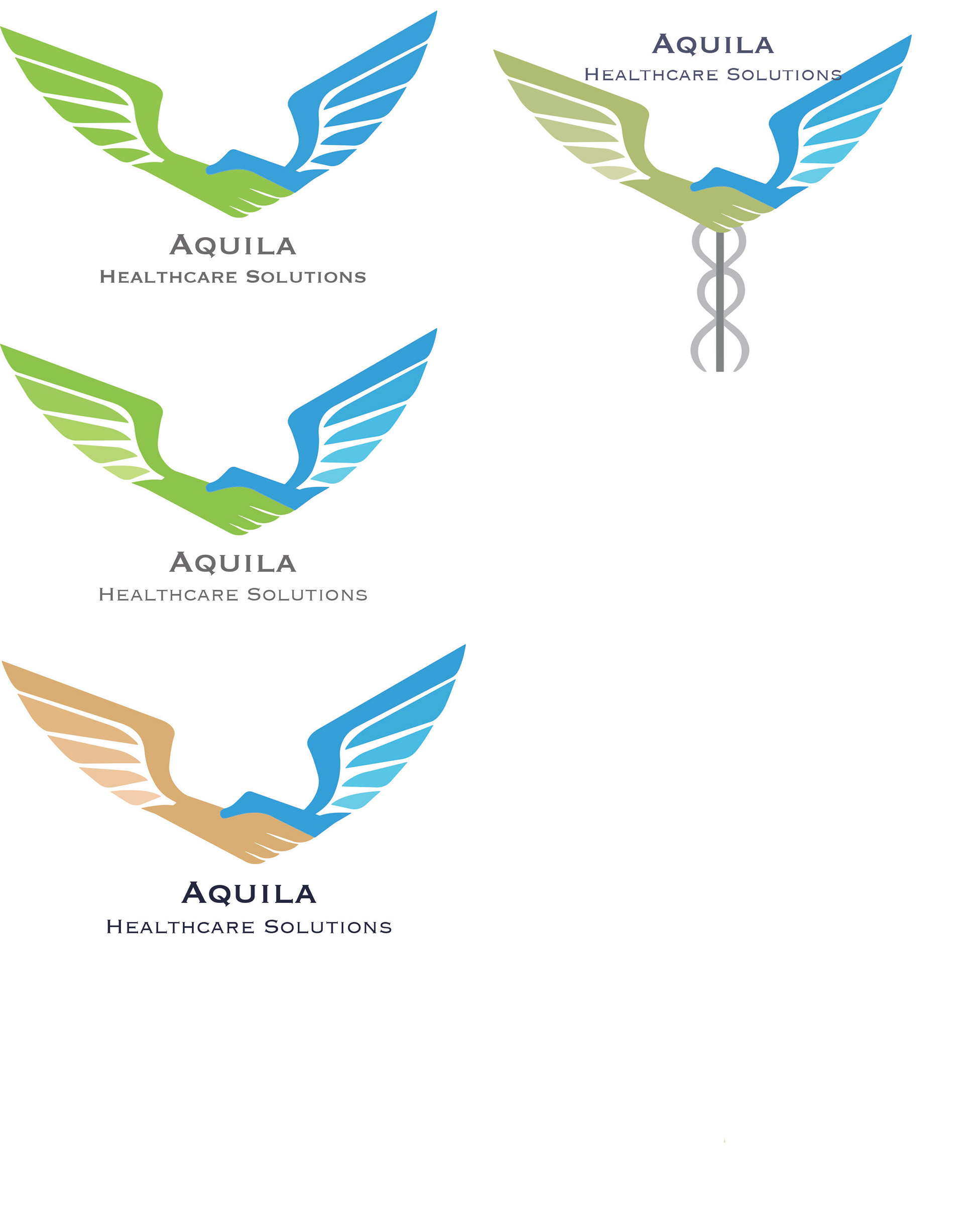
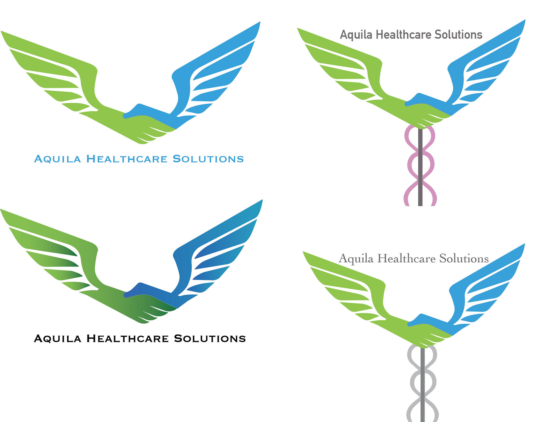
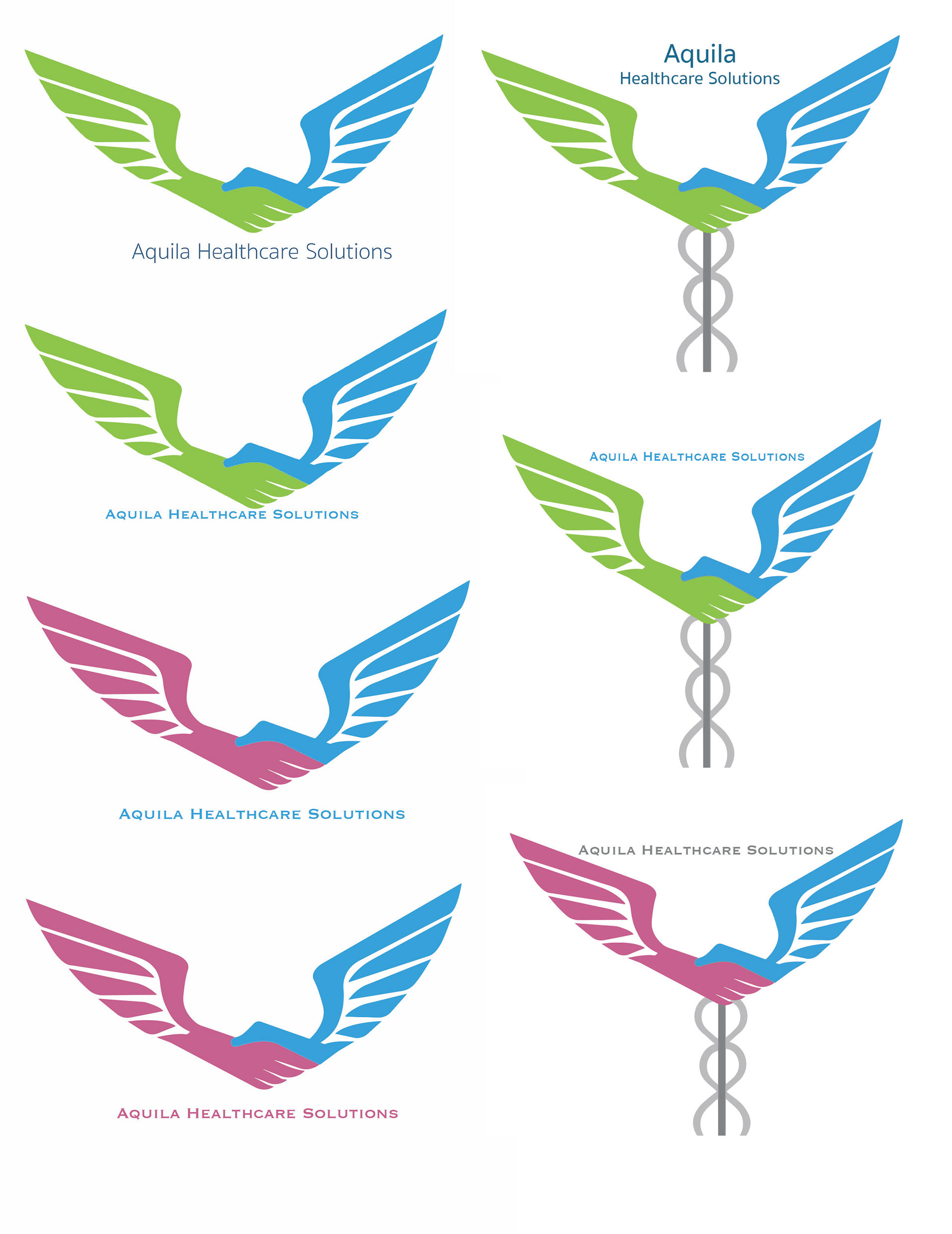
I began by vectorizing the original logo in Adobe Illustrator to ensure consistency and scalability across applications. From there, I explored multiple color combinations and gradient treatments and tested typographic options to create a range of refined logo samples.
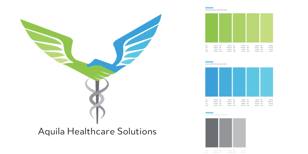
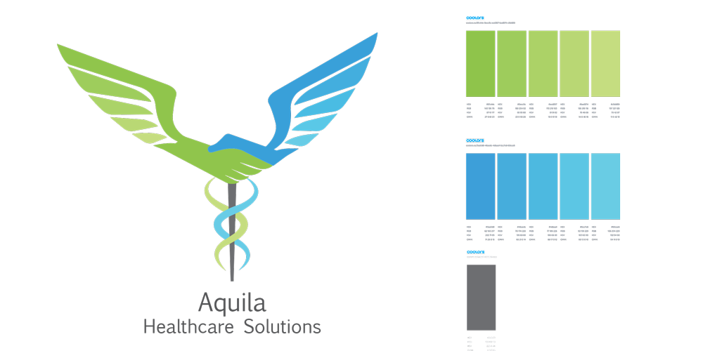
The client selected one of the initial concepts but requested additional versions incorporating a caduceus symbol. After reviewing the existing iconography, I redesigned the caduceus to improve clarity and visual balance. The updated symbol was then integrated into several logo variations, which were presented as a revised concept set for the client.
Outcome
The final deliverables included multiple polished logo options that expanded the original identity while maintaining consistency with the brand’s medical focus. The refined designs provided the client with flexible, production-ready logo variations suitable for continued brand development.
