ATAR Website Redesign is a conceptual redesign focused on improving the overall structure, usability, and visual clarity of an existing website. The goal of the project was to create a more intuitive and engaging user experience while maintaining a clean, modern visual style.
I began the project by reviewing the existing website and identifying usability issues, including inconsistent hierarchy, unclear navigation, and opportunities to improve content organization. Based on this analysis, I defined goals for the redesign that focused on simplifying navigation, improving readability, and creating a more cohesive layout.
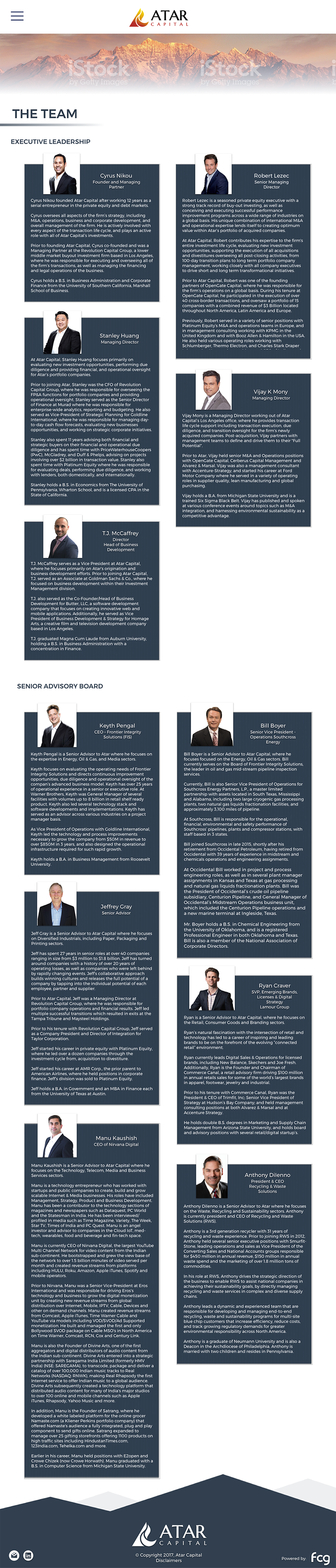
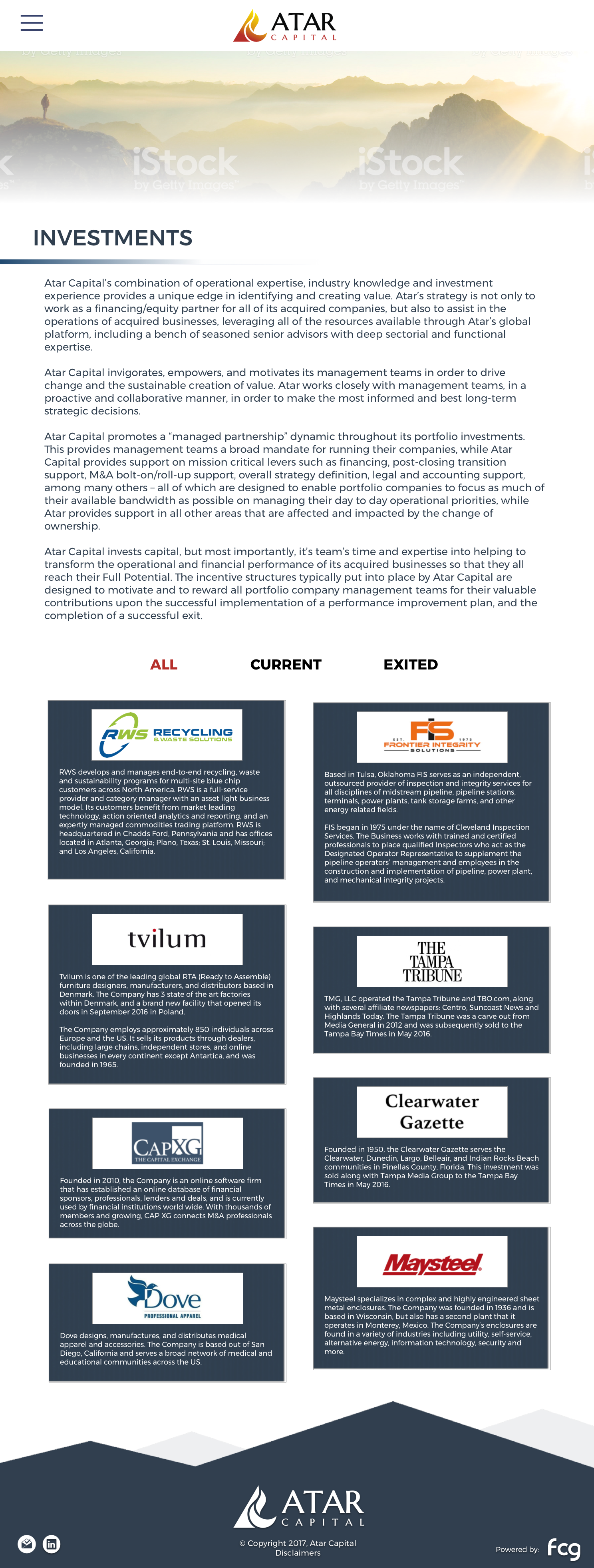
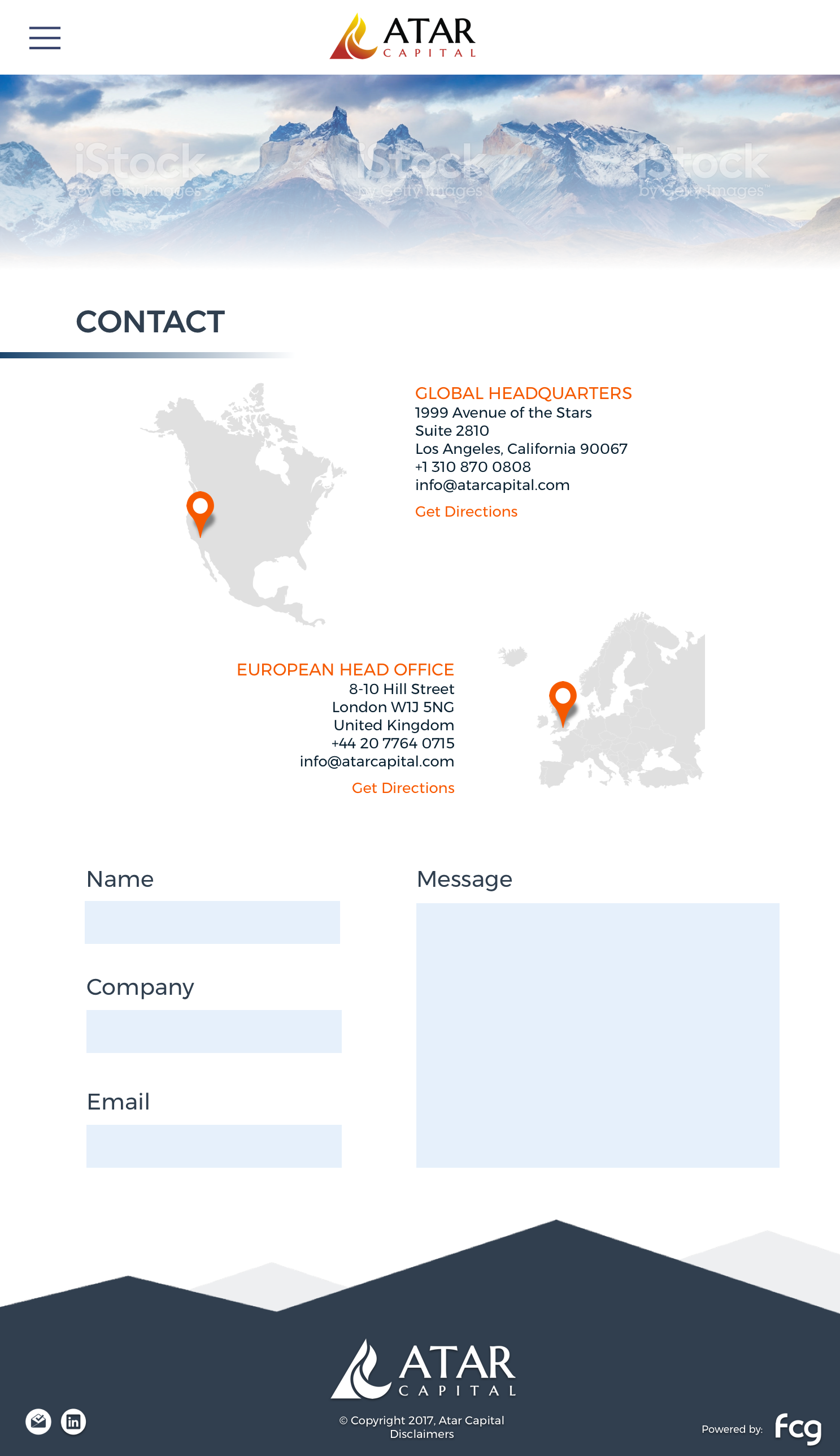
Next, I explored layout options and interface structures, focusing on hierarchy, spacing, and consistency across pages. I designed wireframes and visual layouts that prioritized clarity and ease of use, ensuring that key information was easy to find and visually balanced.
Once the structure was established, I developed high-fidelity interface designs that incorporated a refined color palette, improved typography, and a more cohesive visual system. Throughout the process, I focused on aligning visual design decisions with usability goals.
This project highlights my ability to analyze an existing product, identify areas for improvement, and translate those insights into a clear, user-focused web redesign.
Tools: Figma, Adobe Illustrator
Focus: UI design, information hierarchy, usability, visual consistency

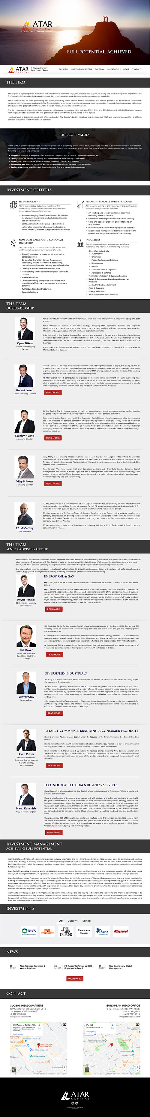
A side-by-side comparison highlighting improvements in layout, hierarchy, navigation, and visual clarity.

Below are selected pages from the redesigned ATAR website, showing the updated layout, navigation, and visual system applied consistently across the site.