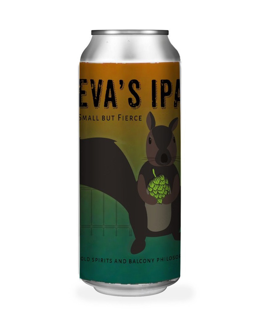
Eva’s IPA is a narrative-driven craft beer packaging concept inspired by resilience, quiet companionship, and small-batch independence. Designed to stand apart from loud, trend-heavy beer branding, the label blends warmth, personality, and restrained boldness.
Project Overview
Eva’s IPA explores how storytelling can differentiate craft beer packaging in a crowded market. Instead of relying on aggressive hop imagery or hyper-saturated trends, this concept centers on character, atmosphere, and emotional tone.
The design positions beer not just as a product, but as a personality.
The Challenge
Craft beer packaging often competes through visual intensity — heavy textures, loud color palettes, and maximalist typography.
The challenge was to create a label that:
• Stands out without shouting
• Feels bold but approachable
• Balances grit with charm
• Connects emotionally rather than aggressively
The goal was subtle distinction rather than volume.
The Concept
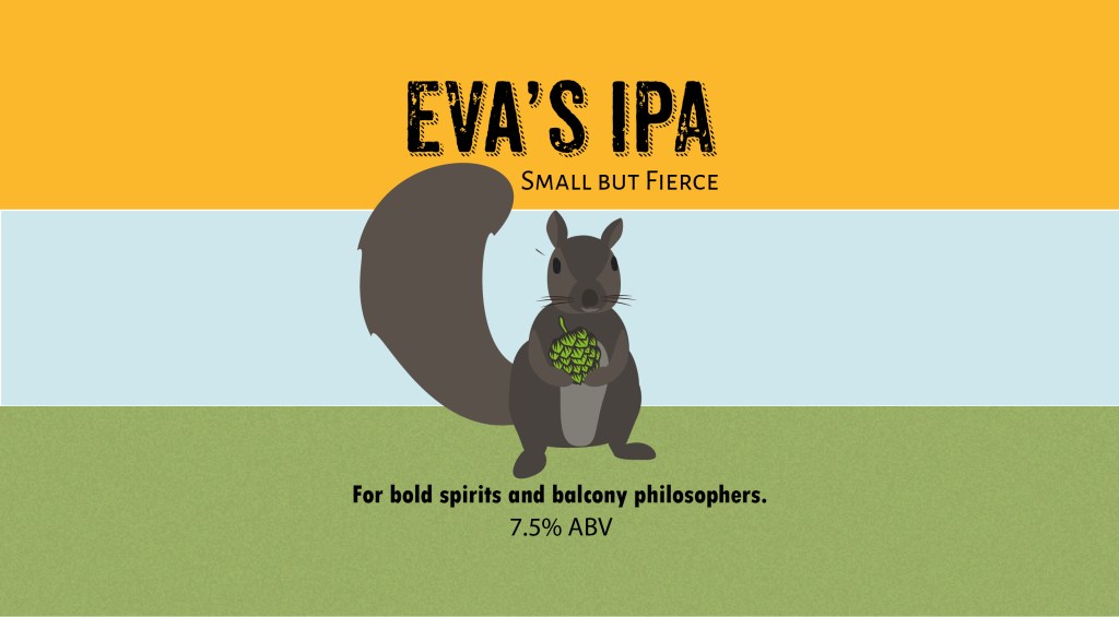
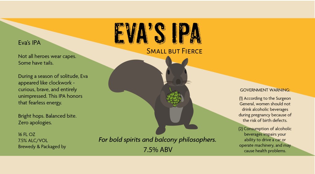
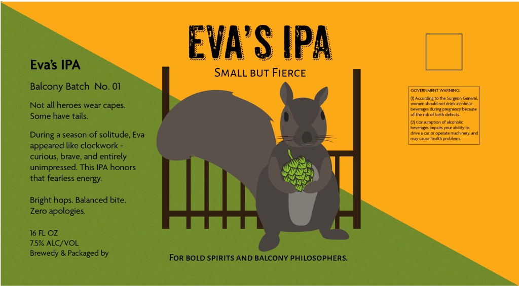
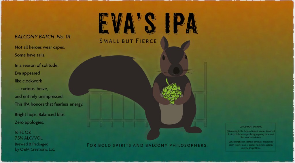
“Small but Fierce.”
At the heart of the design is Eva — poised, alert, and holding a hop cone like a trophy. She represents resilience, curiosity, and quiet confidence.
The balcony setting introduces narrative context: independence, reflection, and small-batch spirit. The poetic copy reinforces this tone, replacing conventional beer marketing language with something more intimate and self-aware.
This is packaging designed to be discovered, not demanded.
Design Approach
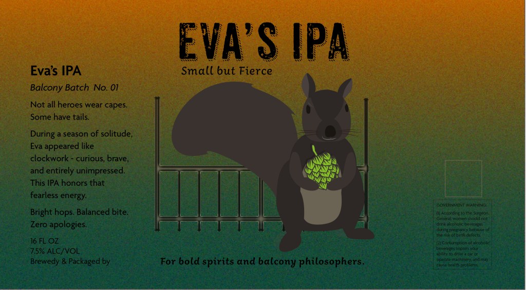
Color & Atmosphere: A warm-to-deep green gradient evokes golden hour shifting into depth — visually bridging warmth and bitterness, lightness and strength.
Hierarchy & Focus: The composition guides the eye from title → character → hop → tagline, ensuring both immediate shelf impact and close-up discovery.
Typography: Distressed headline typography introduces strength and texture, while refined secondary type maintains balance and readability.
Narrative Copy: Short-form poetic language replaces traditional selling points, positioning the beer as a companion rather than a commodity.
Deliverables
• 16 oz can label design
• Full wrap layout with print-ready bleed and margins
• Brand narrative and positioning
• Studio and in-context mockups
Eva’s IPA demonstrates how personality-led design can create shelf presence without visual noise.
Process: Eva silhouette exploration and early color tests