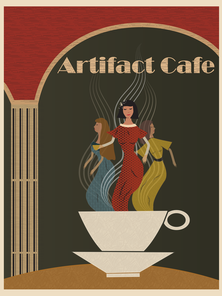
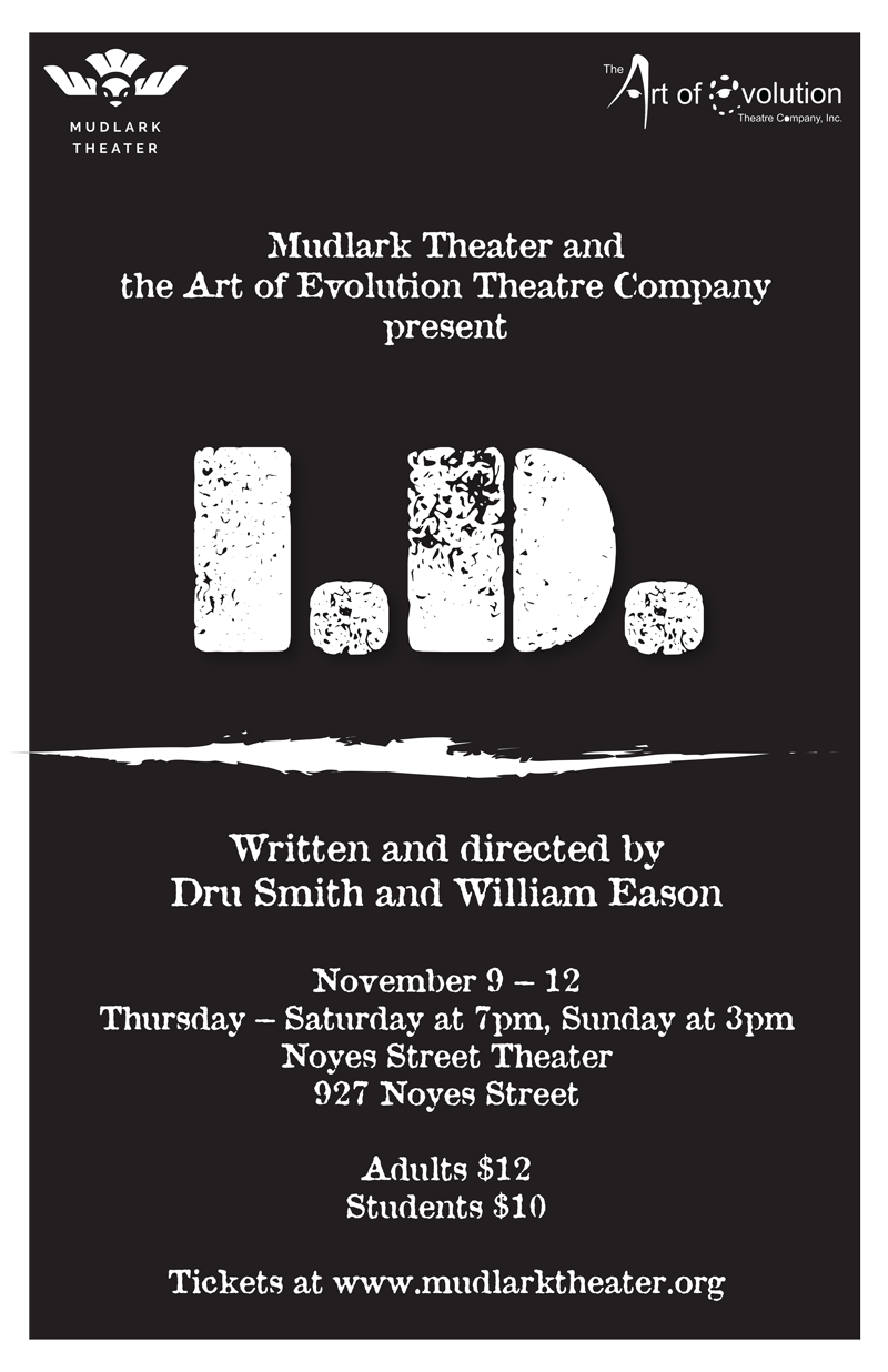
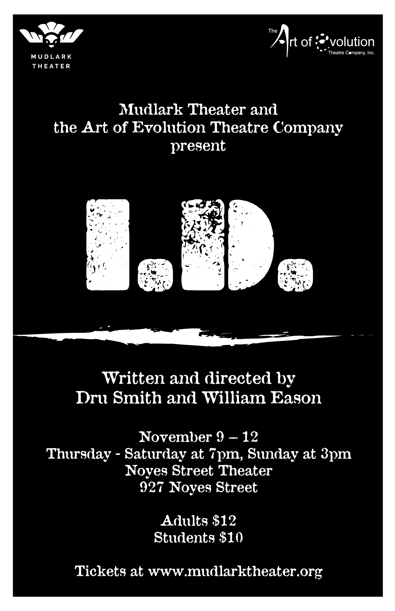
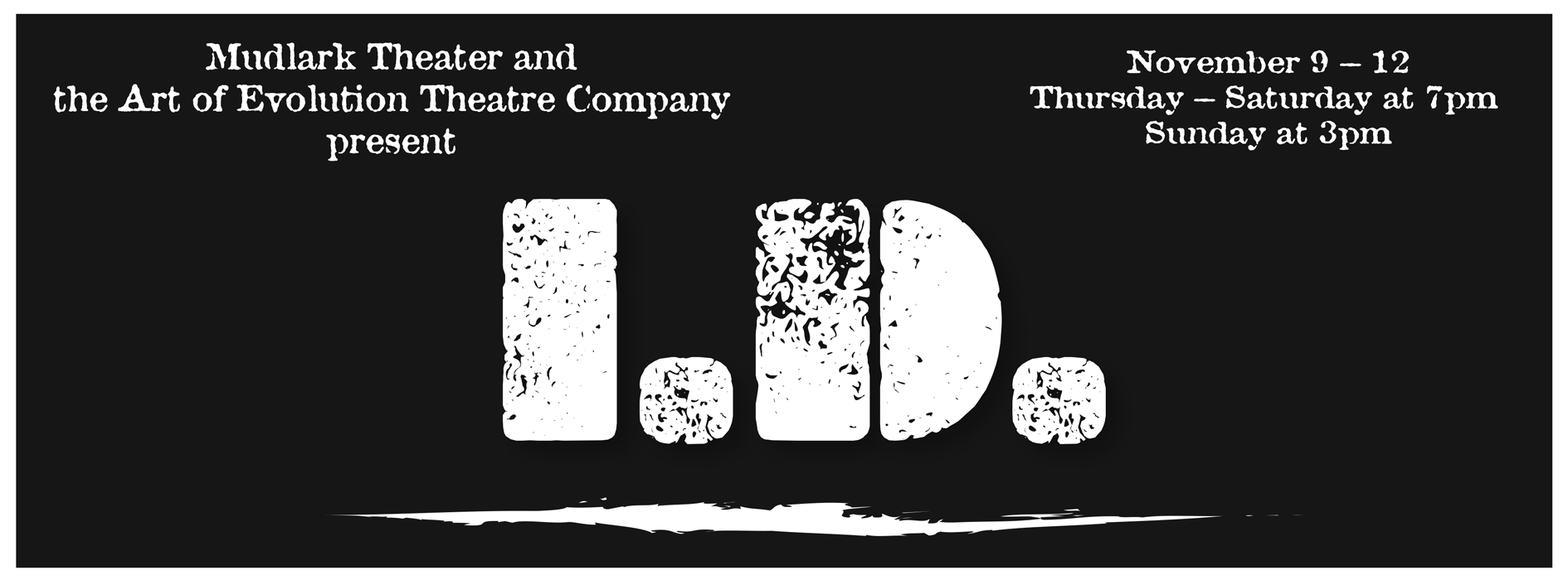
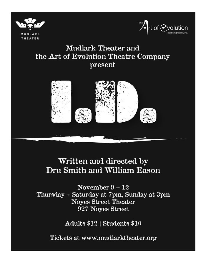
I really enjoy designing posters for the events at the Mudlark Theater Company in Evanston, Illinois. This poster was for a play called I.D. that portrayed issues that children living in Evanston deal with in their everyday lives including: race, ethnicity, and bullying. I wanted this design to be very simple yet bold, so I used a typography that will remind the viewer of street art and graffiti. On the left you can see the original design of the poster, while on the right is a redesign for the second set of shows sponsored by the city of Evanston. I also had to design the I.D. poster Facebook Banner and Postcard versions based on the original poster.

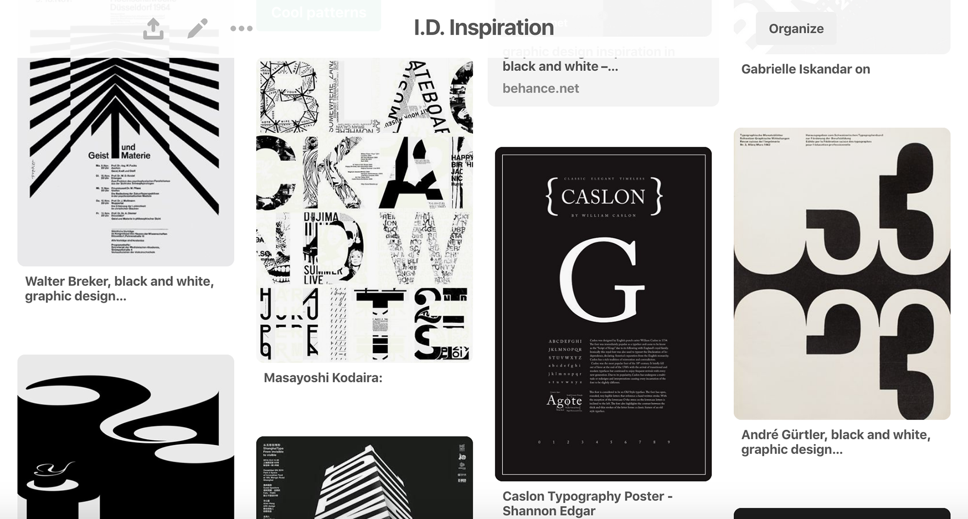
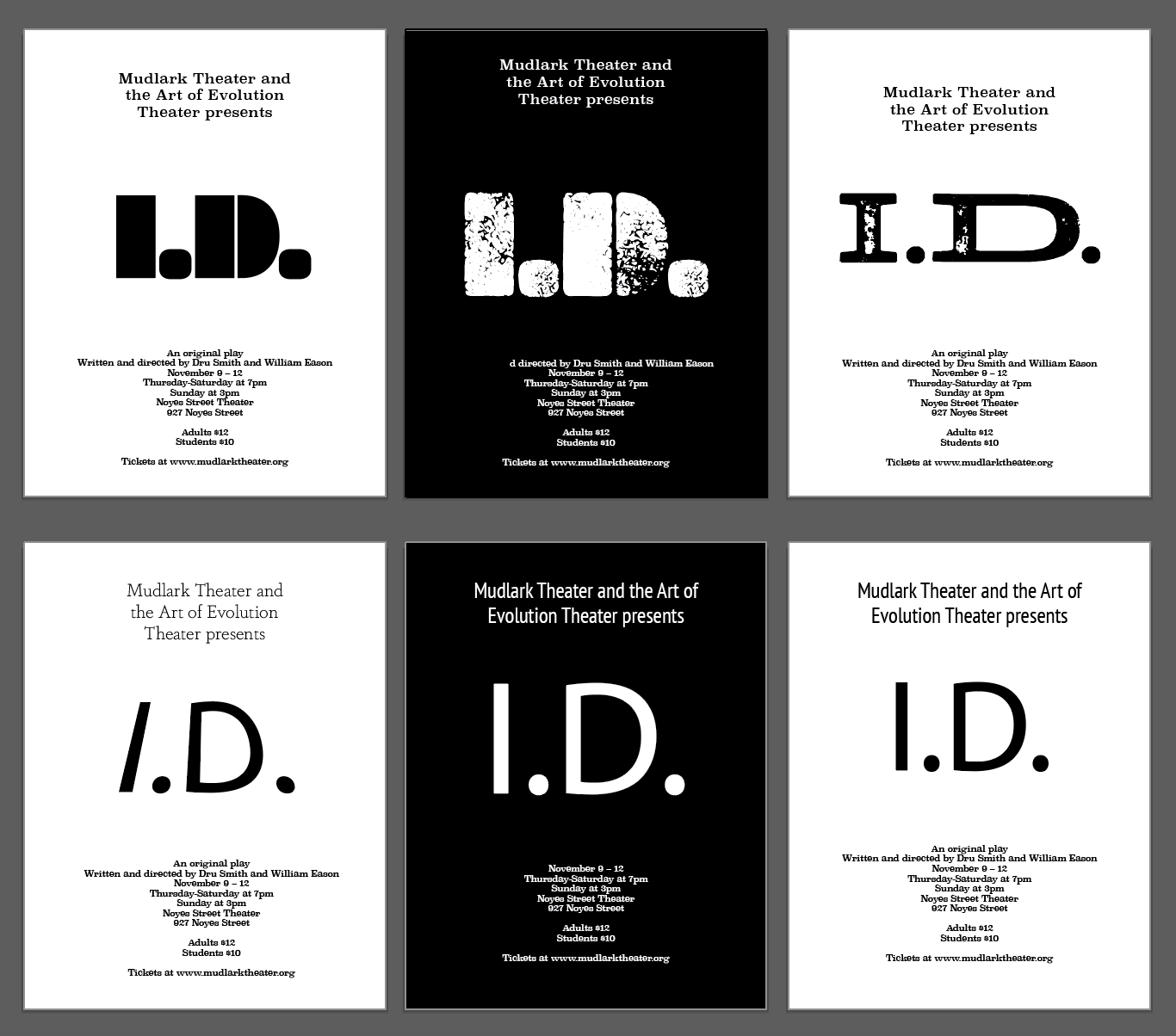
When I was given the description of this project, I searched for some inspiration on Pinterest and created an Art Board. I needed to design a simple black and white poster with a bold type for the title.
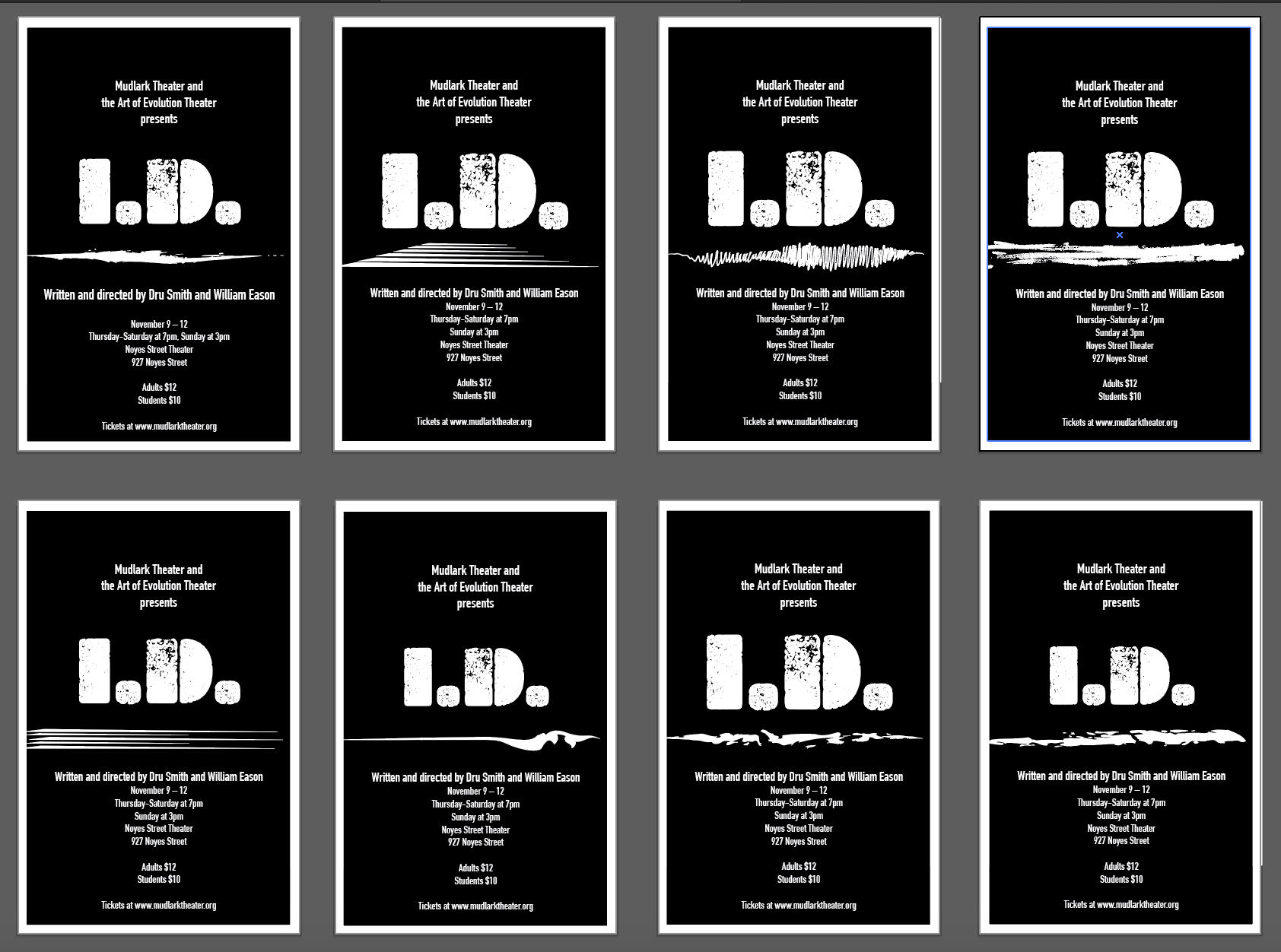
Next, I started developing my own ideas in Adobe Illustrator and below you can see some of my work process. After each set of drafts, I would discuss them with my supervisors, and they would choose the ones they liked the most. Then I would keep developing those posters and show the next set of drafts and kept repeating the process until my supervisors were happy with the design.
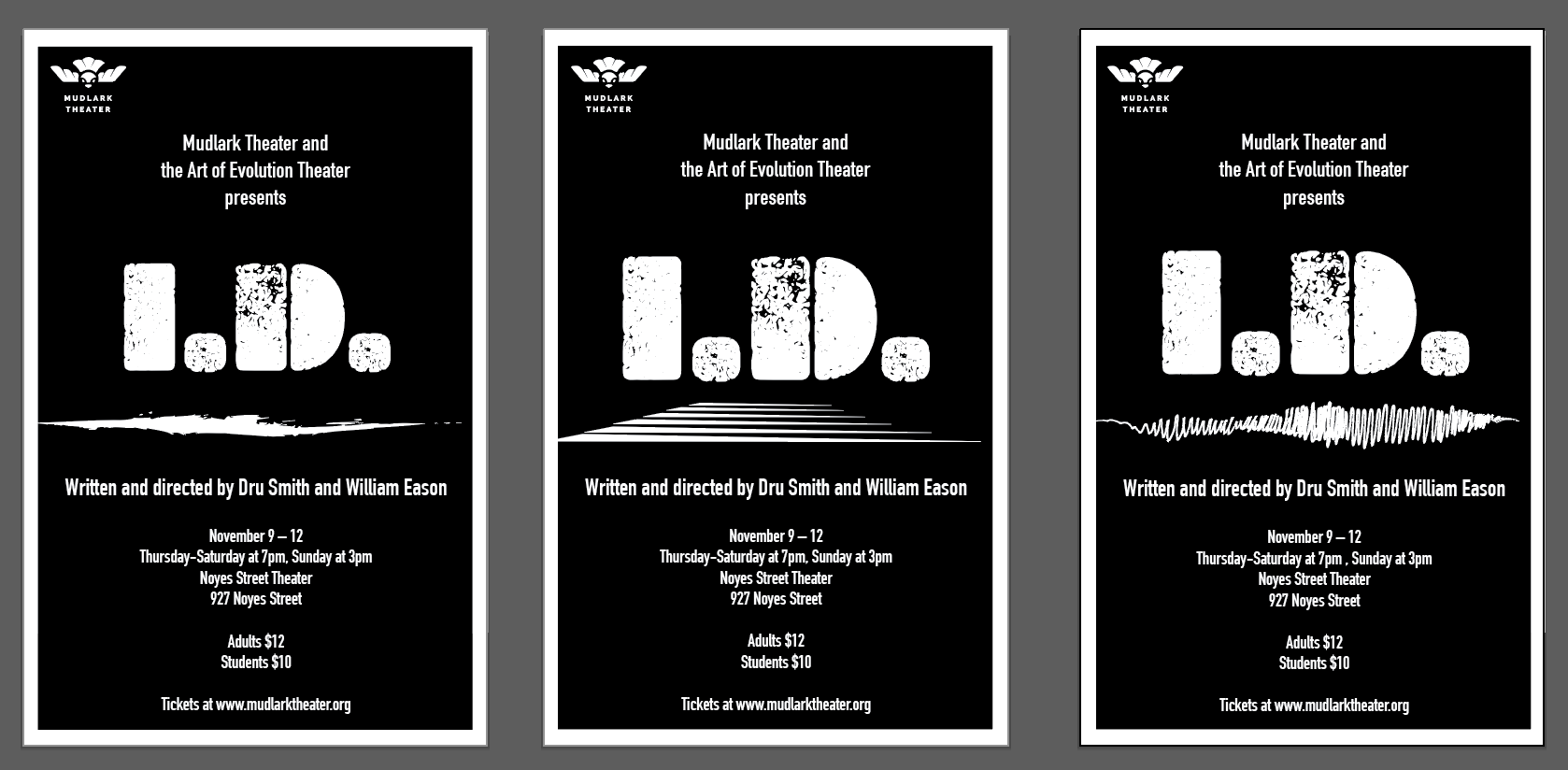
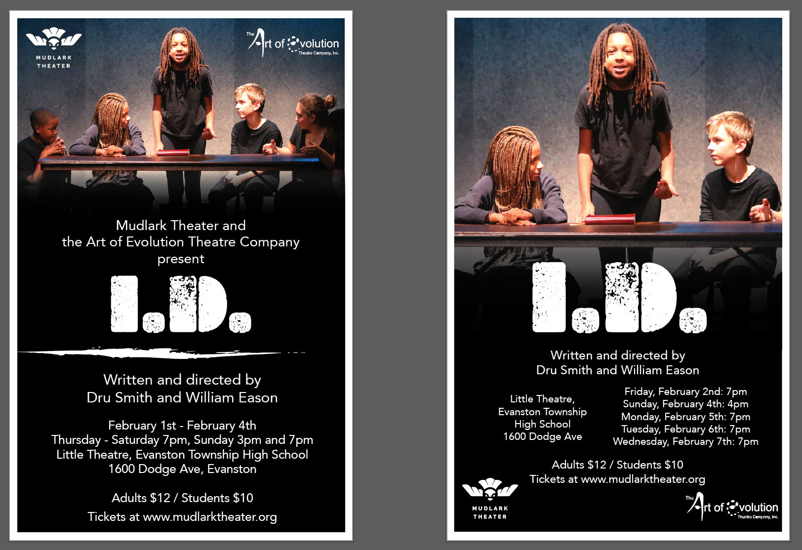
You can see the final version of the I.D. Poster below, along with the design of it that I did for a Facebook banner and a postcard.
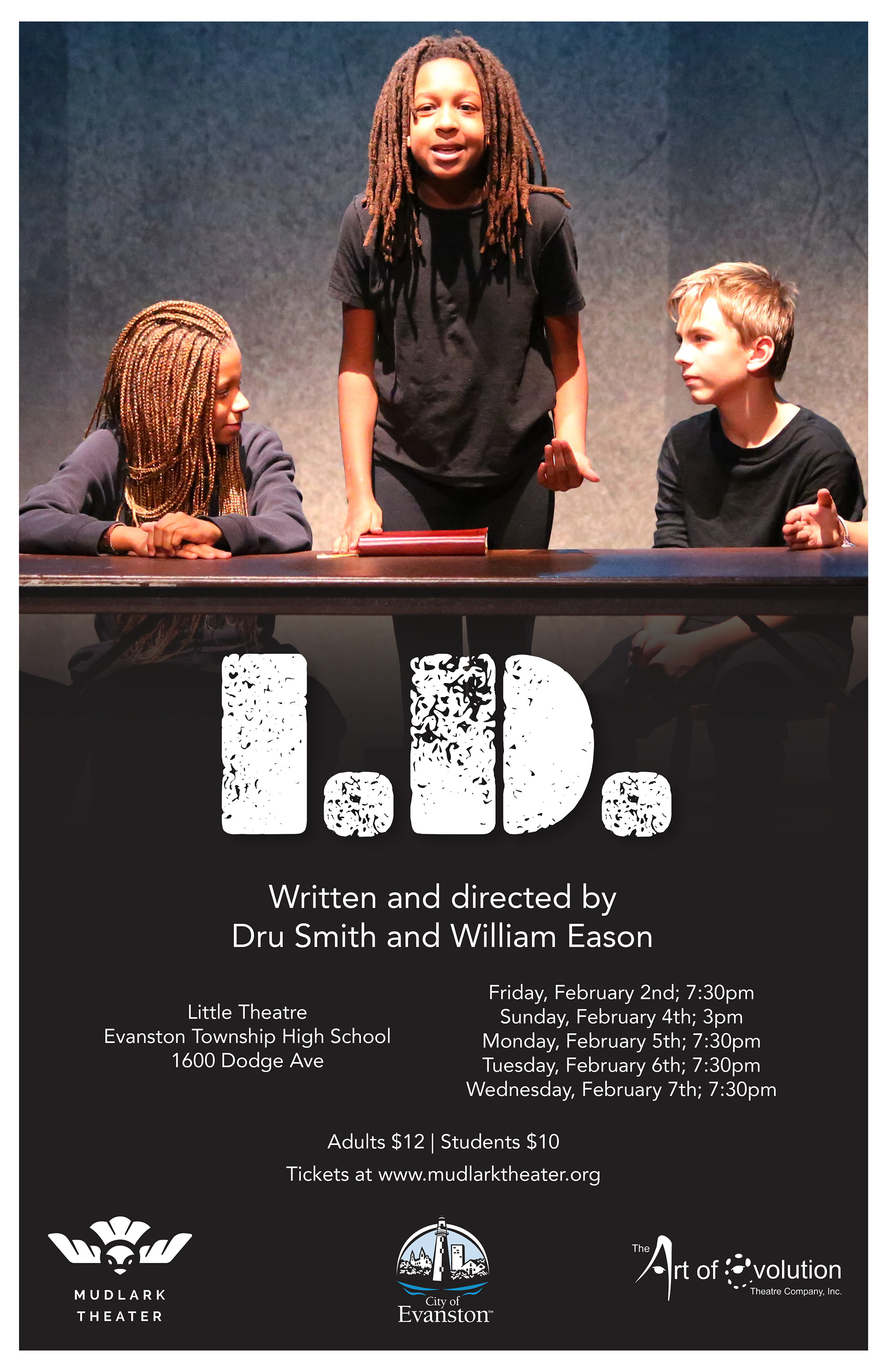
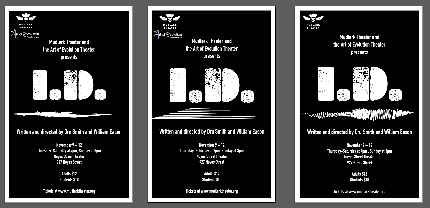
I was given the opportunity to see the I.D. play at Noyes Cultural Art Center in Evanston and it was a wonderful show! Since the play was a great success, the city of Evanston sponsored a second set of shows. I had to redesign the poster for the next set of shows, but this time I had to include a photograph from one of the previous shows. Below, you can see some of my design process as I started to update the poster. At first, I was told to design a landscape poster and to have the photograph take up at least 1/3 of the poster, but it was difficult to add all of the text this way. So I showed different versions of the poster, some landscape, and others portrait. My supervisors agreed that the regular portrait poster looked better.
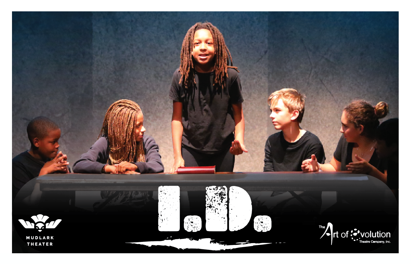
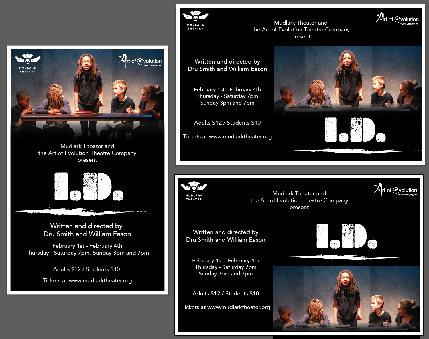
Below you can see the final version of the I.D. Poster designed for the second set of shows, sponsored by the City of Evanston.