Redesign of a community theater call-for-submissions flyer created for Mudlark Theater. Working under a tight timeline and multiple review rounds, I developed a final design that was approved and used for promotion.
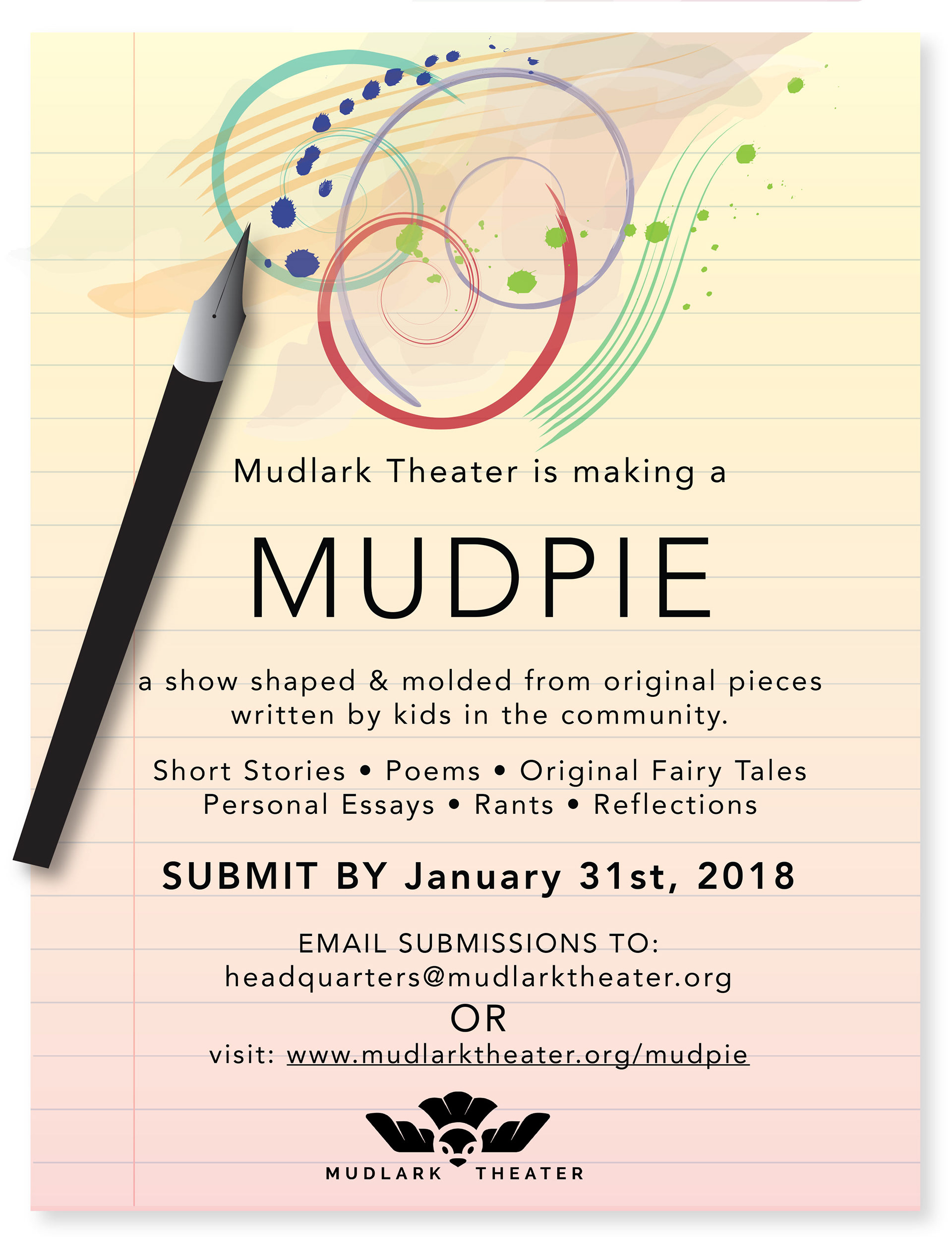
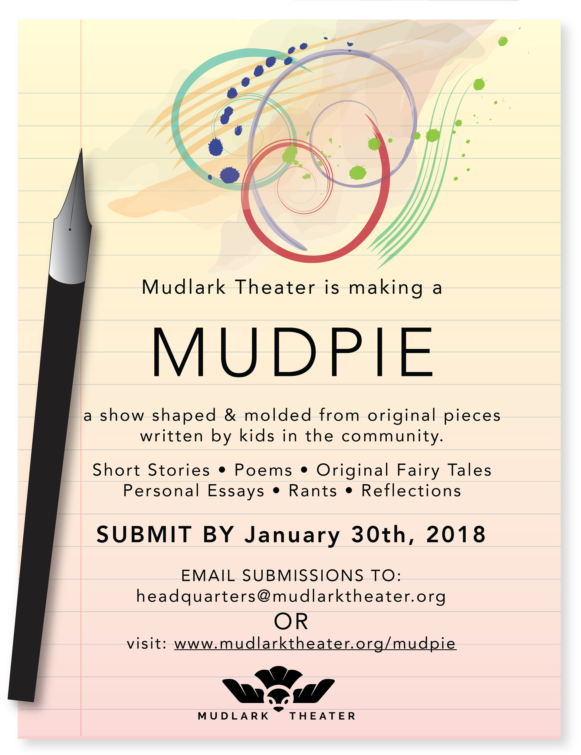
The concept combines abstract ink-inspired vector shapes with a notebook-paper background to reflect creativity, writing, and youth voices. All visual elements were created in Adobe Illustrator using the original copy provided.
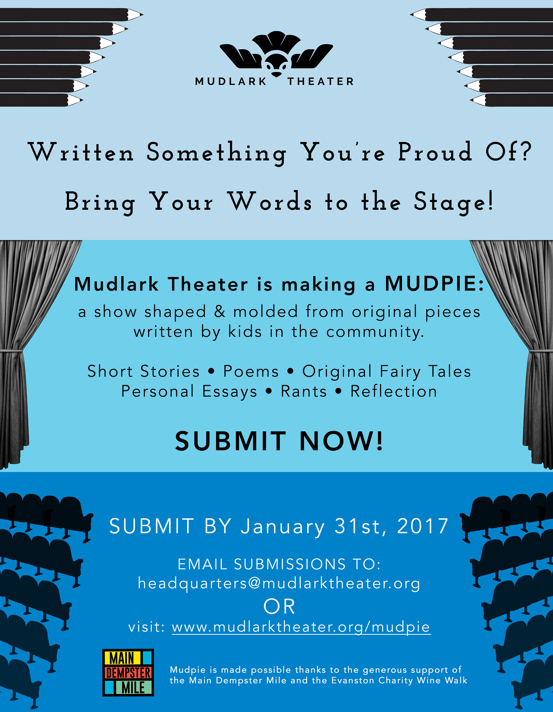
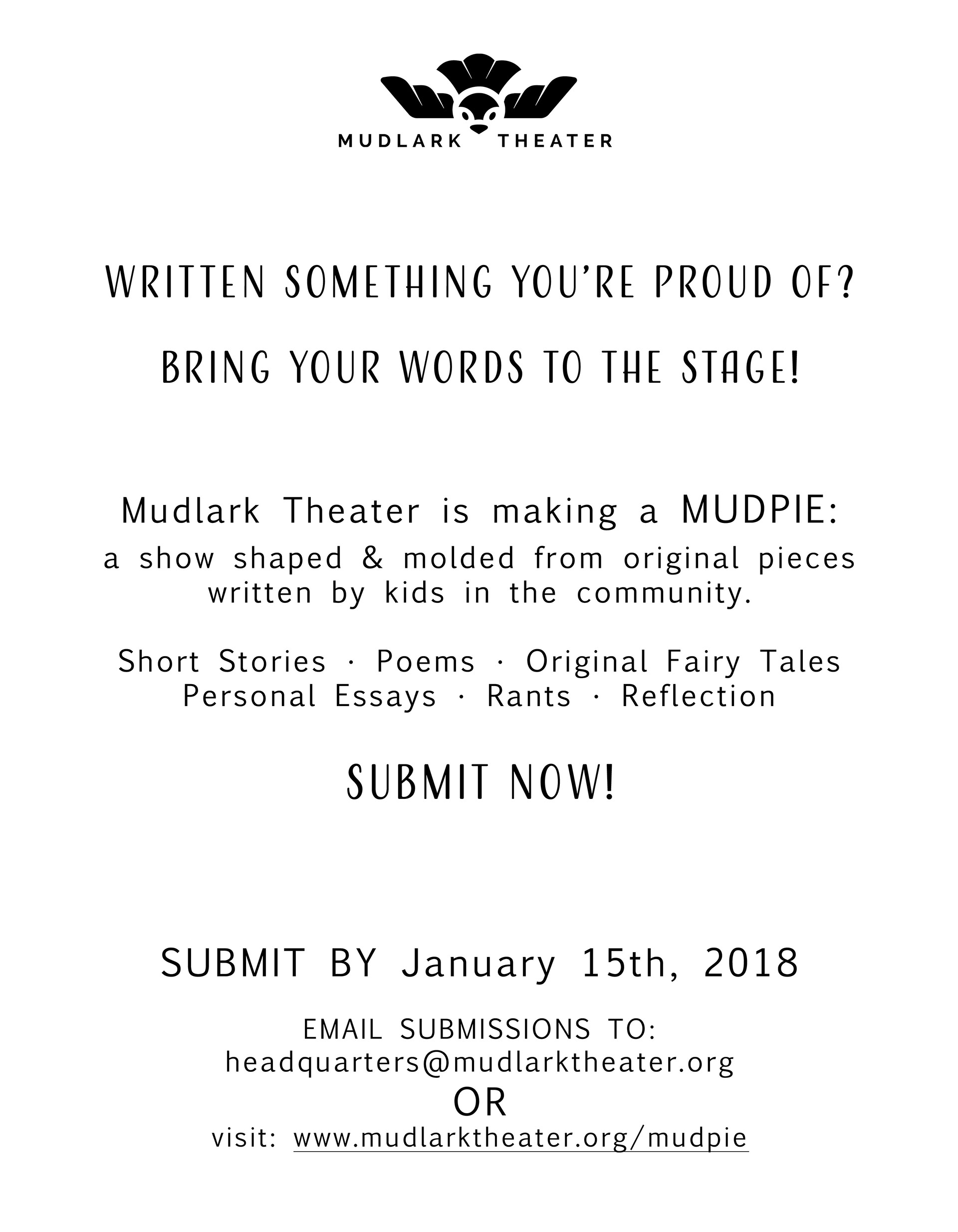
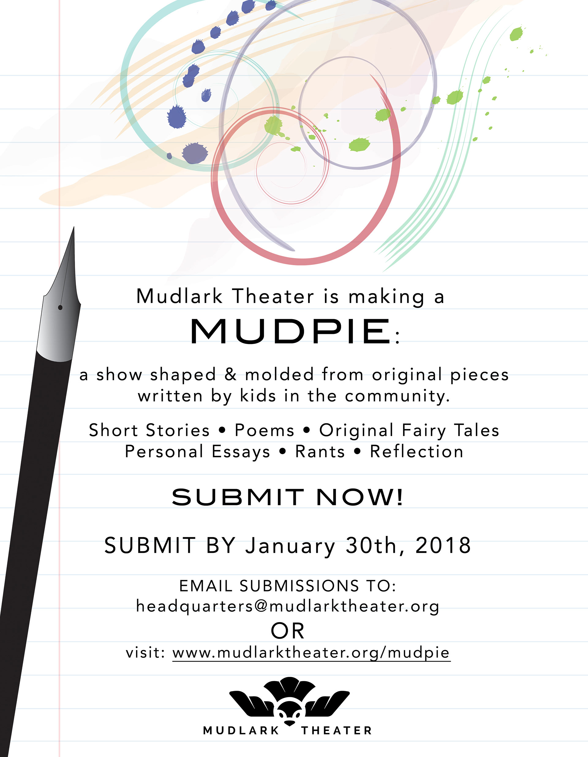
Shown are the original flyer, early draft explorations, and the final approved design.
Below is the original call-for-submissions flyer (on the left) compared with the redesigned version (on the right) highlighting new visual concept and layout.
Below are some early draft explorations showing layout and concept iterations.
Close-up details highlighting vector ink shapes and background texture.



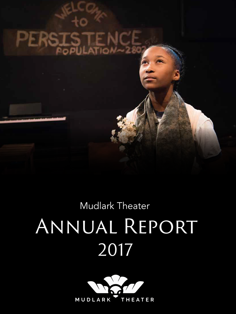
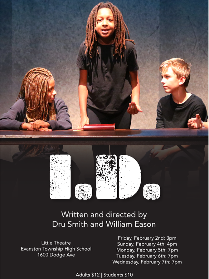
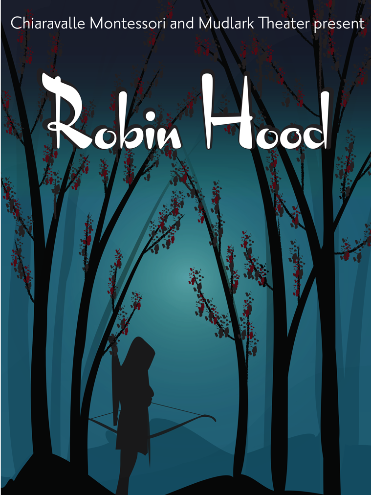
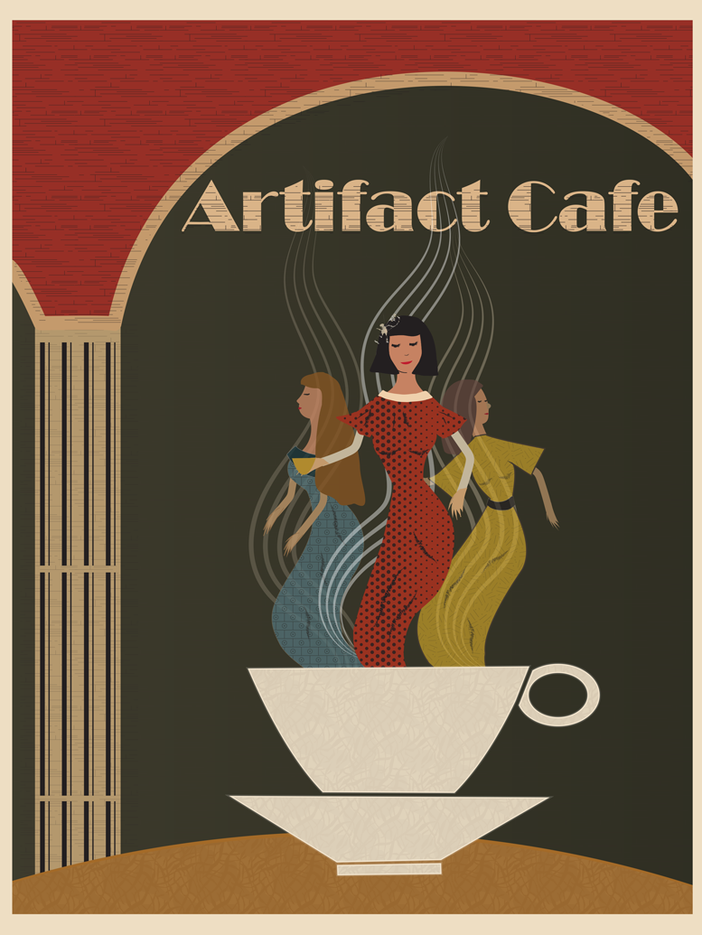
Visual inspiration and references that informed the flyer redesign.


