The United Packaging Website Redesign is a conceptual redesign focused on improving the usability, structure, and overall visual clarity of an existing corporate website. The goal of the project was to make information easier to find while creating a more modern and professional digital presence.
I began by reviewing the original website and identifying areas for improvement, including unclear navigation, dense content, and inconsistent visual hierarchy. Based on this evaluation, I defined goals for the redesign that emphasized clearer organization, improved readability, and a more cohesive layout system.
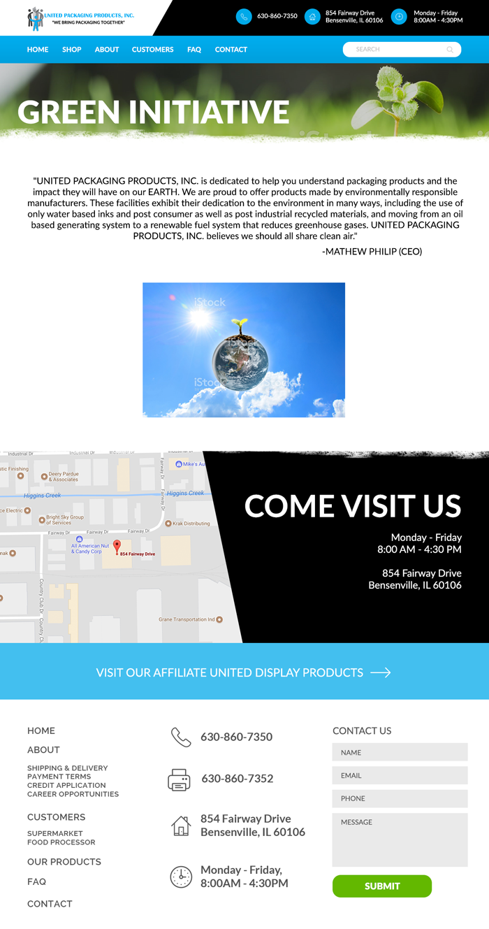
I explored layout and navigation solutions that would better support the site’s content, focusing on hierarchy, spacing, and consistency across pages. Wireframes and visual layouts were developed to organize information more clearly and guide users through the site.
The final designs apply an updated visual system with refined typography, a cleaner layout, and improved spacing to create a more user-friendly experience. This project demonstrates my ability to analyze an existing website and translate usability insights into thoughtful, visually clear interface designs.
Tools: Figma, Adobe Illustrator
Focus: UI design, information architecture, usability, visual consistency
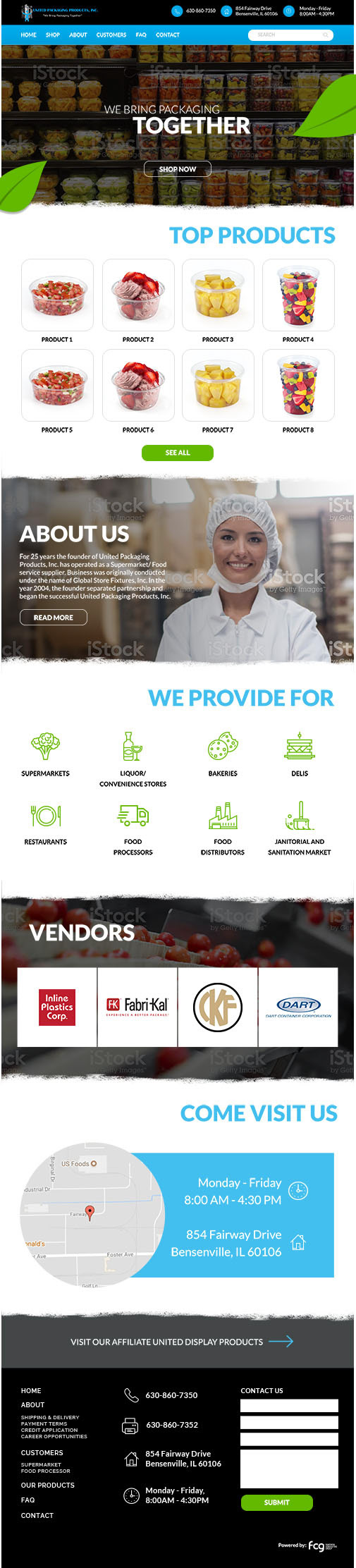
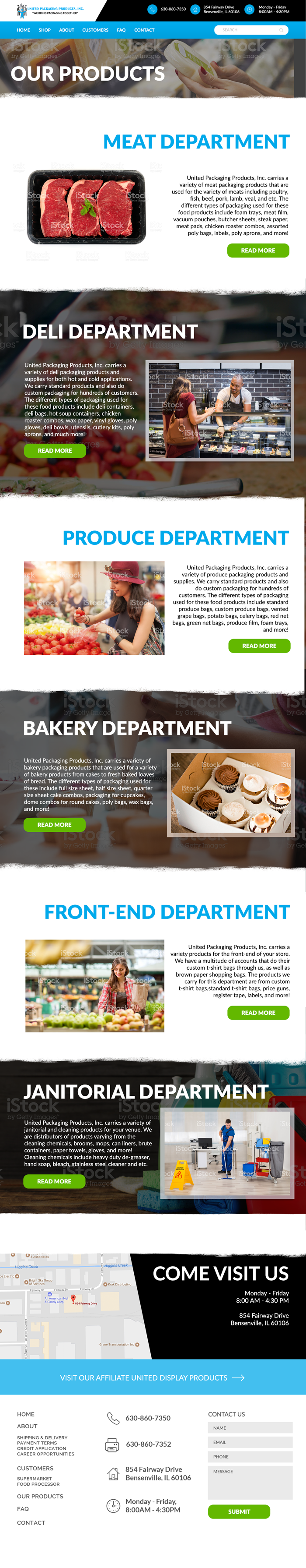
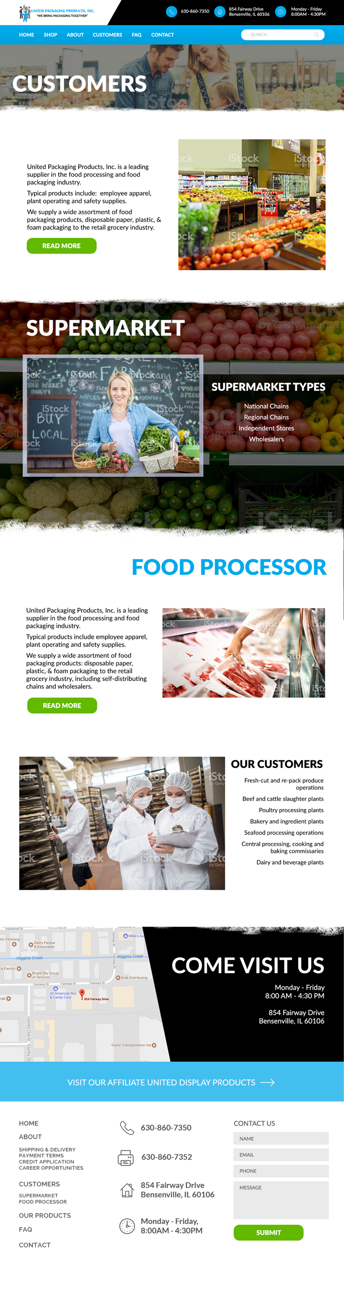
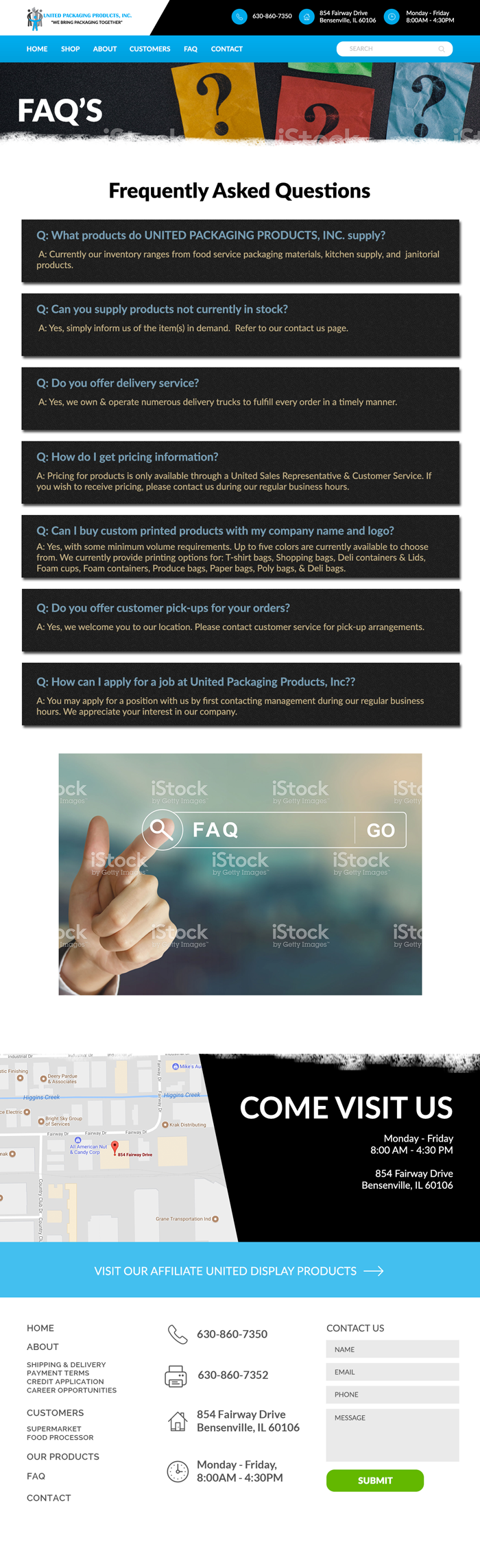
Below is a side-by-side comparison highlighting improvements in layout, navigation, content organization, and visual hierarchy.


Below are selected pages from the United Packaging website redesign, demonstrating how the updated structure, layout, and visual system were applied consistently across the site.