Project Overview
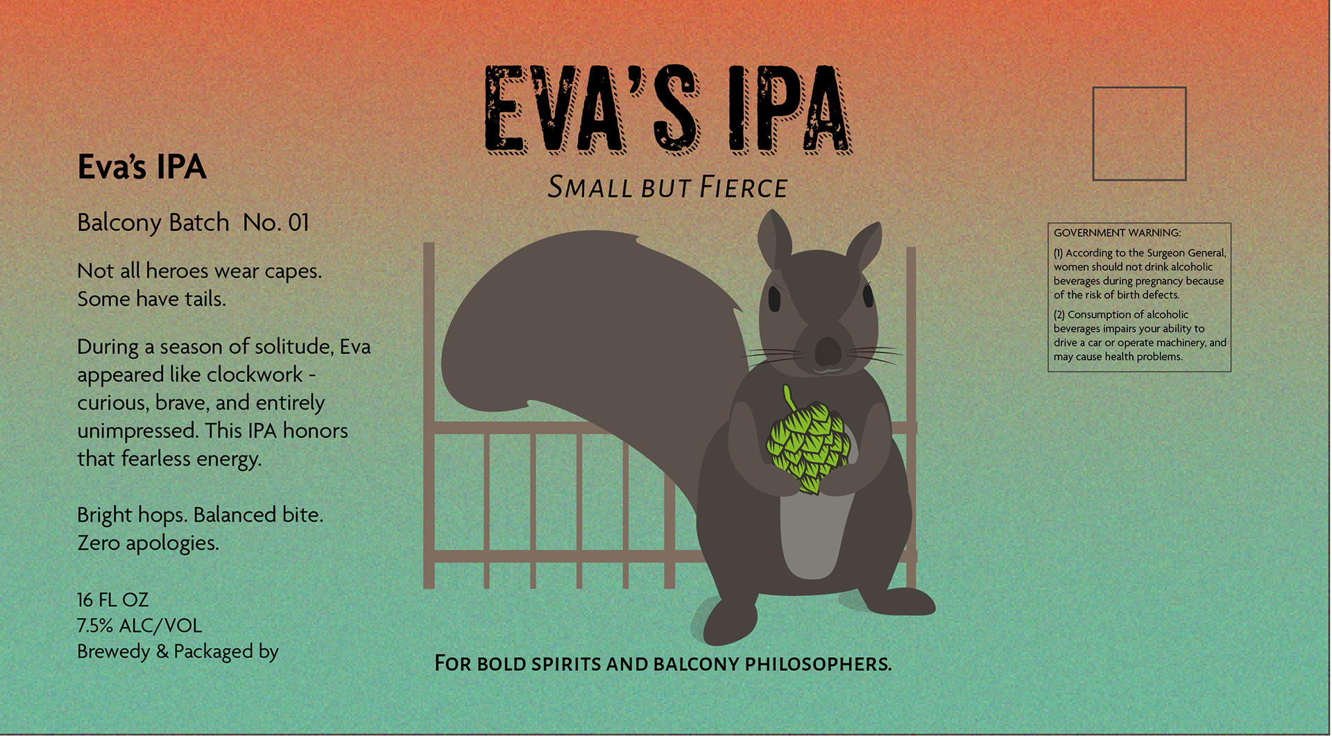
Eva’s IPA explores how storytelling can differentiate craft beer packaging in a crowded market. Instead of relying on aggressive hop imagery or hyper-saturated trends, this concept centers on character, atmosphere, and emotional tone.
The design positions beer not just as a product, but as a personality.
The Challenge
Craft beer packaging often competes through visual intensity — heavy textures, loud color palettes, and maximalist typography.
The challenge was to create a label that:
•Stands out without shouting
•Feels bold but approachable
•Balances grit with charm
•Connects emotionally rather than aggressively
The goal was subtle distinction rather than volume.
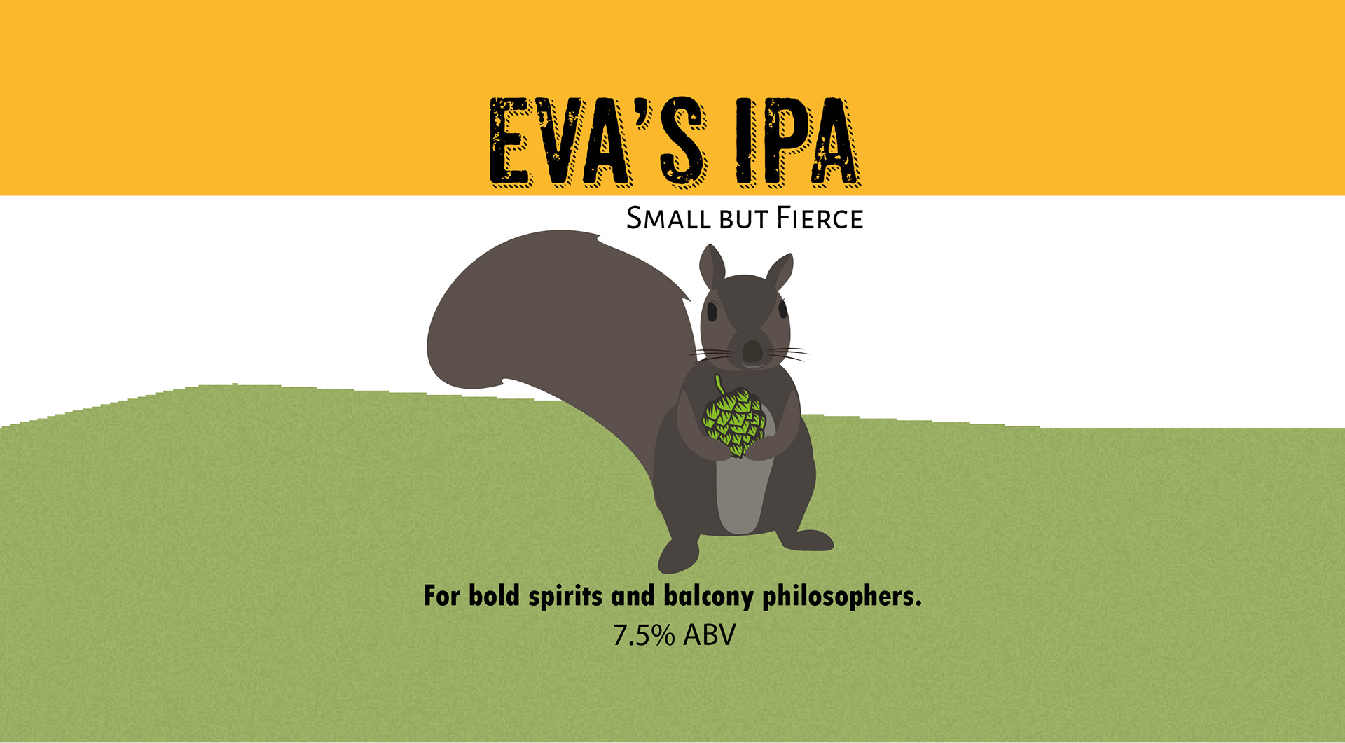
The Concept
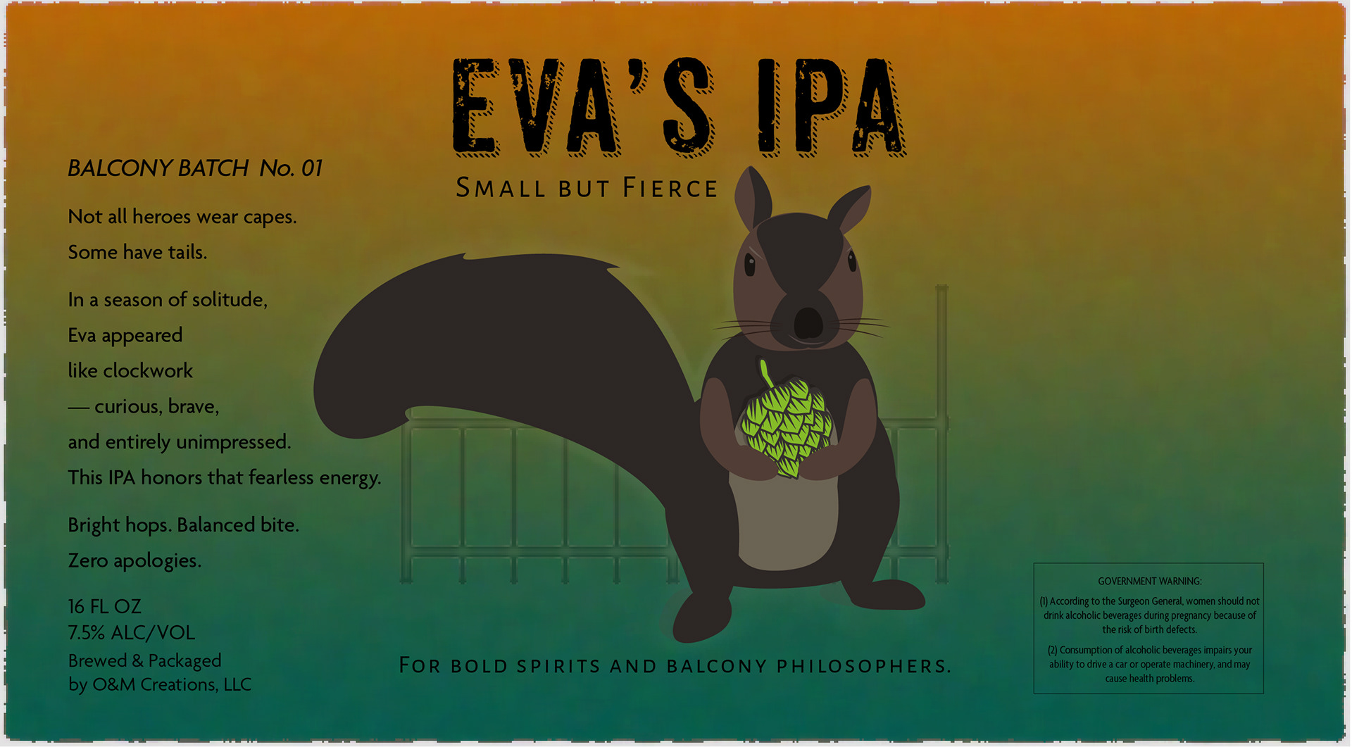
“Small but Fierce.”
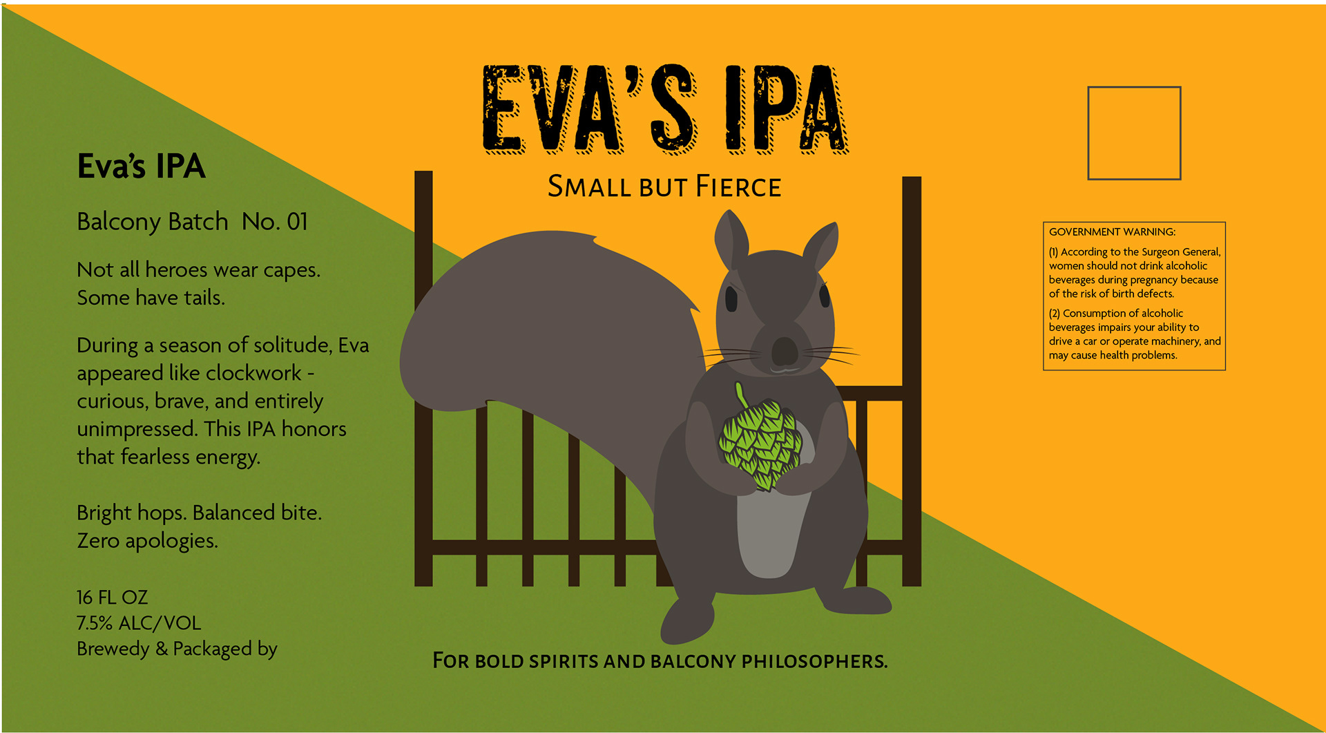
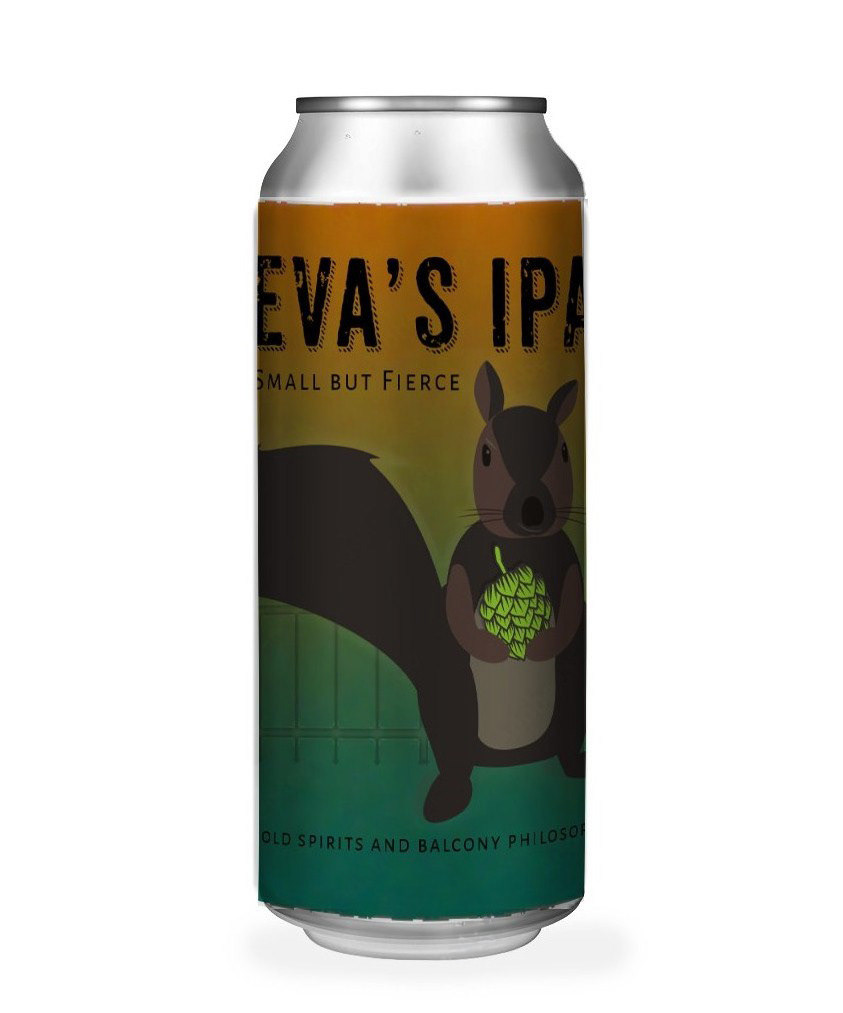
At the heart of the design is Eva — poised, alert, and holding a hop cone like a trophy. She represents resilience, curiosity, and quiet confidence.
The balcony setting introduces narrative context: independence, reflection, and small-batch spirit. The poetic copy reinforces this tone, replacing conventional beer marketing language with something more intimate and self-aware.
This is packaging designed to be discovered, not demanded.
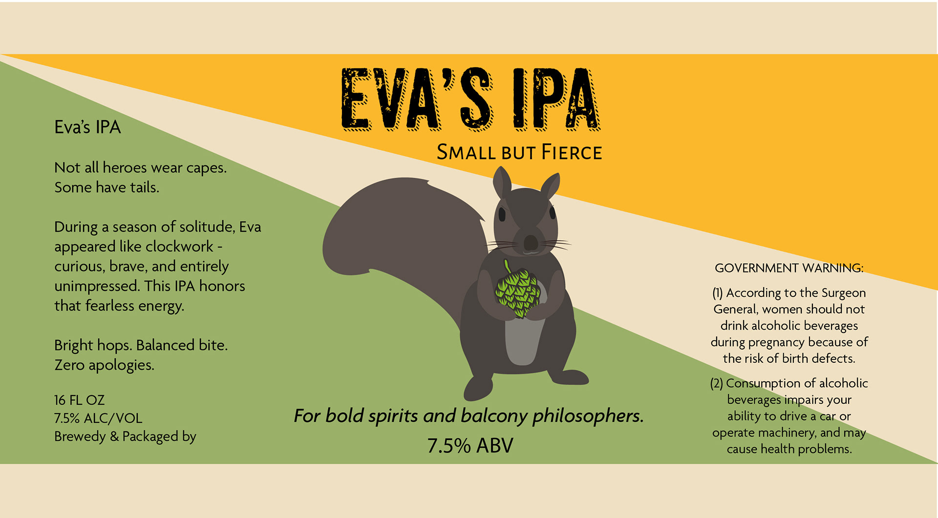
Design Approach
Color & Atmosphere: A warm-to-deep green gradient evokes golden hour shifting into depth — visually bridging warmth and bitterness, lightness and strength.
Hierarchy & Focus: The composition guides the eye from title → character → hop → tagline, ensuring both immediate shelf impact and close-up discovery.
Typography: Distressed headline typography introduces strength and texture, while refined secondary type maintains balance and readability.
Narrative Copy: Short-form poetic language replaces traditional selling points, positioning the beer as a companion rather than a commodity.
Deliverables
•16 oz can label design
•Full wrap layout with print-ready bleed and margins
•Brand narrative and positioning
•Studio and in-context mockups
Eva’s IPA demonstrates how personality-led design can create shelf presence without visual noise.
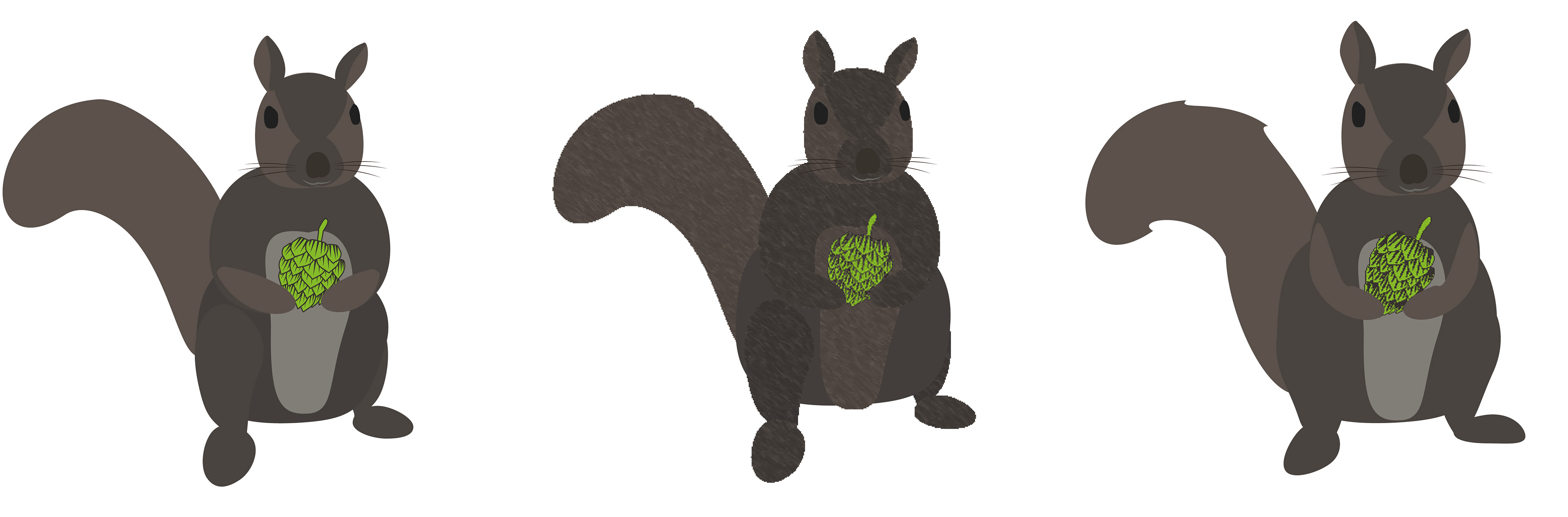
Process: Eva silhouette exploration and early color tests